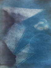
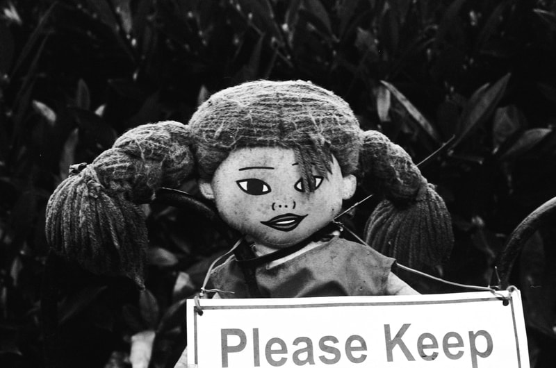
Photograms -
|
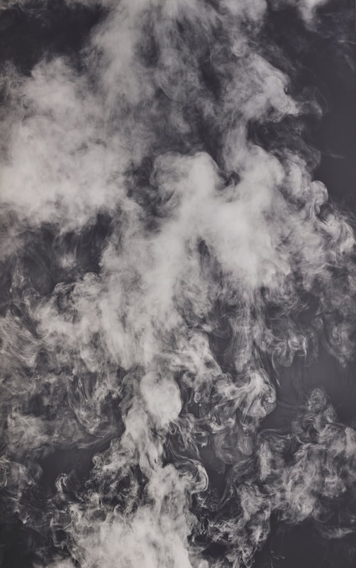
Not too dissimilar from the traditional ideas of photography, cameraless photographs utilise the chemicals and photographic paper we might expect, yet in a way that obscures the subjects. We are presented with a distorted perspective brought to us only by silhouettes and shadows of the objects being documented. This technique is often employed to bemuse the audience as the photographer is often a little in the dark as to what the outcome will be, and the work is not always easy to understand; in this sense it is more similar to other forms of art with similar intentions - to document yet alter slightly.
|
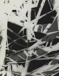
György Kepes
Structure Photogram (1939-40)
|
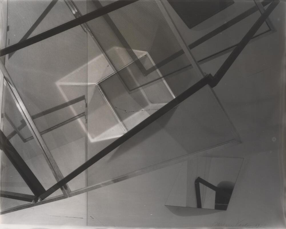
Barbara Kasten
Untitled 13 (1979)
|
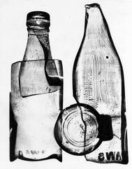
Nigel Henderson
Photograph of a photogram of a milk bottle (1949-51)
|
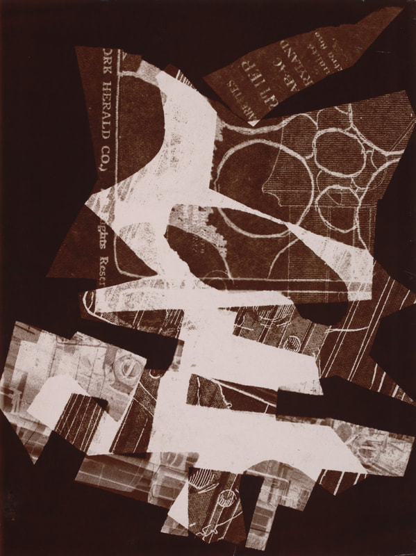
Christian Schad (Schadographs) -
|
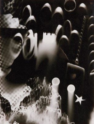
In his work with photograms, Schad uses old disregarded objects such as things he has collected in the street or had a previous use for. For his first experiments without using a camera he left the photos by his windowsill to develop, often ripping up the edges to release them from the confines of a square as was typical, and still is today. His work is that of the first of abstract photography; up until this point it was just being used for more documentary purposes such as in photojournalism and in court. I like the collage effect that is in many pieces such as the third one displayed below, as they vary from the smooth, smokey effect achieved in his other pieces. It reminds me of the artist Henri Matisse as he makes similar looking pieces yet using other mediums such as paper.
|
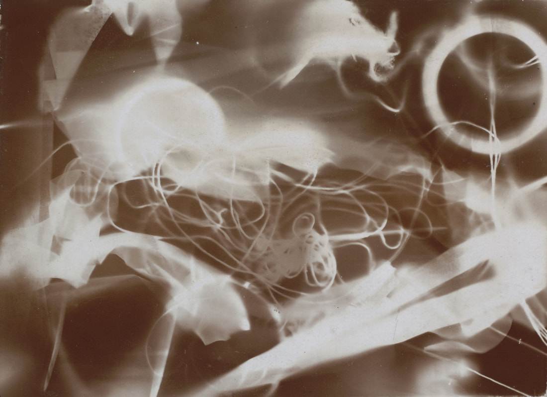
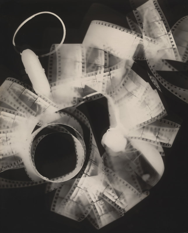
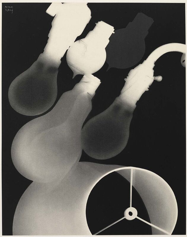
Man Ray (Rayographs) -
|
Man Ray was a renowned fashion and portrait photographer who worked with photograms which he called 'rayographs'. Much of his work, particularly in this style is reminiscent of Dada as it falls in the boundary between fact and fiction; in terms of form, the props are documented perfectly however the lack of tone prevents it from being accurately represented. In his work Ray tends to use circular objects such as lightbulbs, metal coils and rolls of film giving them a distinct character amongst the many photograms that exist in the world of photography. In comparison to Schad's work, Ray's is a lot more simple, focusing on the shape of individual objects rather than the composition of many. The rayographs are also more easily distinguishable as they don't have so many overlapping things whereas the schadographs create texture through layering; as the photograms only show the silhouette of what is being documenting, the layering is what adds the confusion to Schad's pieces. Although I like the complexity of the schadographs, I prefer the simplicity of Ray's photograms as you can easily depict what is going on.
|
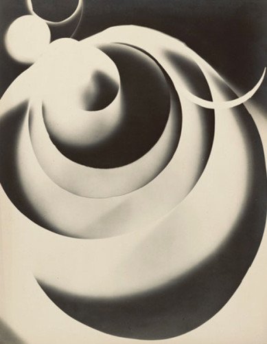
Laszlo Moholy-Nagy (Photograms) -
|
Laszlo Moholy-Nagy was a Hungarian modernist whose career spanned from the late 1910s-1940s and was influenced by Dadaism, Suprematism and Constructivism. Similar to Schad, he uses layering of objects to create more complicated photograms, often undistinguishable thus blurring the boundary between real life and abstract. Throughout his work it is evident that Moholy-Nagy is fascinated by the interaction of elements and their interconnectivity with time, space and light; this was the also case for his paintings within which these themes are advocated. He begun his work during WW1 alongside being an officer in the artillery and continued as a professor, painter and photographer. Many of his photogram - particularly copies - were edited after with paint, graphite and varnish for the sleek look he is known for.
|
How to develop film -
As preparation, the chemicals for the fixer, developer and stop bath need to be mixed and ready for use. Then, the film itself needs to be developed; this part of this process requires complete darkness so as not to expose the film being developed.. The film is popped open using a bottle or film opener and thread onto a spiral/ reel until there is not more film left to thread. The developer is poured as quickly as possible into the tank that contains the film and the sealing cap is fit on. The tank needs to be tipped up and down to remove air bubbles and spread around the liquid so it can work. The total time it requires varies from film to film. This then needs to be poured out and replaced with the stop bath solution which is kept in for around ten seconds. The fixer comes next and needs to be left in for at least 3 minutes being agitated throughout. The fixer can be removed. The film needs to be washed in water either under a tap or in the tank and dried to produce negatives.
Digital Photoshoot -
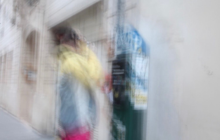
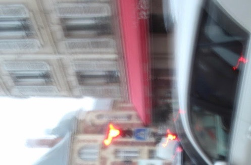
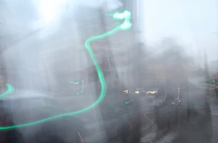
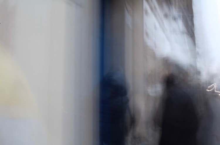
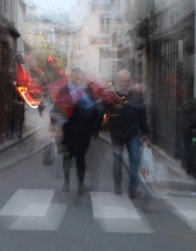
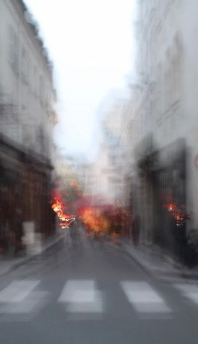
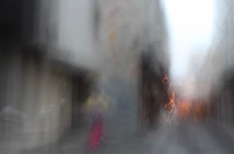
For my digital photoshoot I decided to exploit the word 'movement' using longer exposure than I typically would to create a forced blur in the photos. This obstructed the view a little which is what I wanted as it rids us of a clear sense of place and familiarity that was there before. I made this decision in order to mirror the confusion that I felt being in an area of London that I don't tend to visit as well as dramatically cropping some photos from their original frame in order to get rid of certain elements such as buildings and road signs that indicate where we are. For me the most successful photo was that of the two people crossing a road as you can clearly see what is going on yet all sense of identity has been cut from the photo due to the blurred effect and the cropping of he image that was done in the editing process afterwards. For this particular shoot I found that the editing of the photos was more relevant to the theme than the content that I was shooting at the time as the frame of the photo made a huge difference in the overall composition.
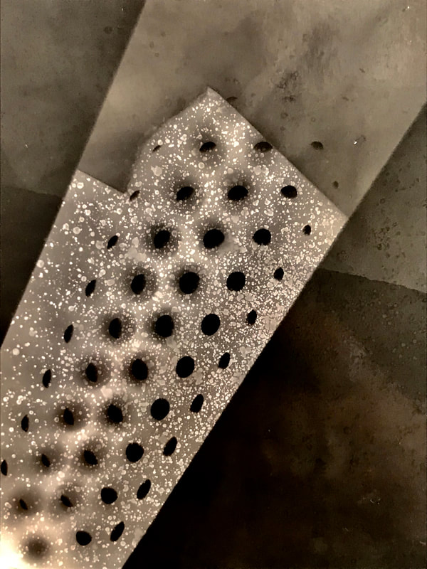
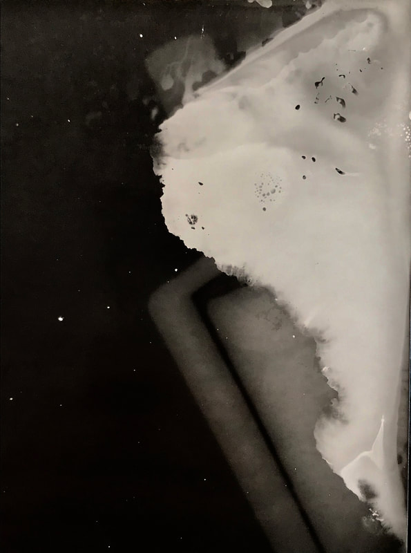
My response in the darkroom -
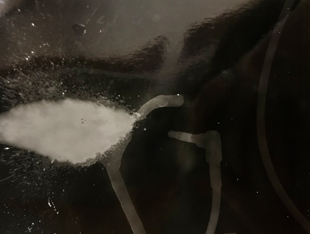
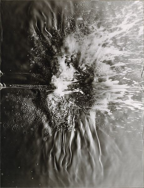
In response to the work I have been studying, I created some photograms on my own in the darkroom. First, I tried making basic photograms with film, netting and other items that I felt would make for an interesting composition. I found that the bolder, thicker lines of metal and plastic objects worked well as they made for a stark contrast with the black and therefor a photo that is easier to decipher. I also found that the photograms with the used film worked well as not only did I capture the shape of the object, I also was able to produce a smaller version of the photo taken on it; after looking at this I am encouraged to experiment with using negatives on acetate or used film in order to create images that are truer to life as they can demonstrate a range of tones, not just black and white. In addition to this, I looked at chemigrams - a process developed in the 1950s whereby chemicals resist the light and in some cases causes unpredictable colours when reacted with the developer. I found that these made for a messier and more unpredictable outcome as it was hard to manipulate the liquids how I wanted. However, one test that I found particularly successful was a combination of a photograms and chemigrams. I sprayed a perfume in such a way that it looked as if it was being fired out a headphone jack and, despite some spillages, it was fairly effective.
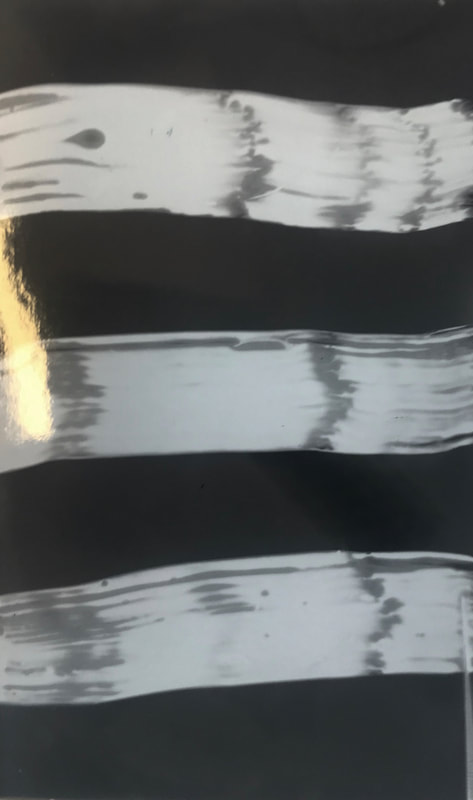
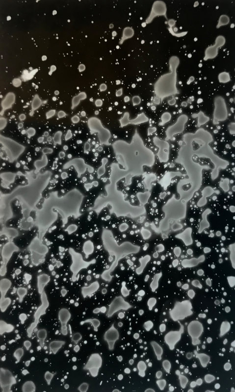
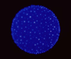
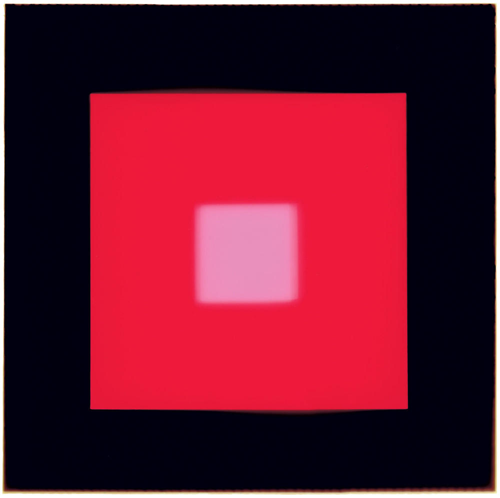
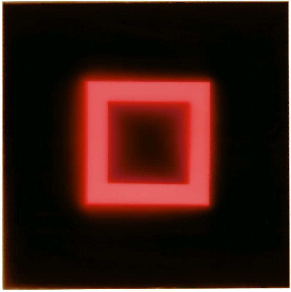
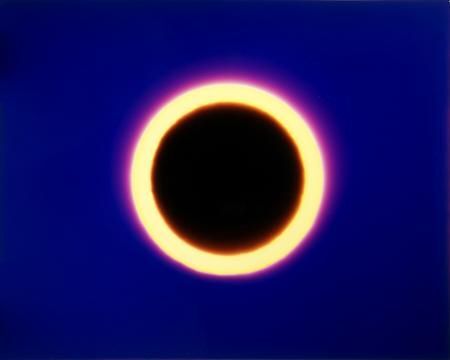
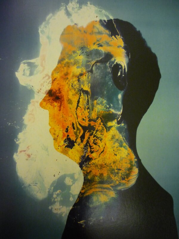
Gary Fabian Miller -
Gary Fabian Miller is a British photographer whose work, since the 80s, has been generated in the dark room and resonate a primal yet interstellar excitement. This paradox is what Miller aims to communicate in his photograms; elementary shapes such as the solo circles, lines and squares that are easy for the eye to interpret, and the blazing intensity of the bright colours work together and play with themes of contrast. In addition to this, the circles suggest a motif of life and enlightenment. For me, the ideas expressed in Millers work evoke us to connect with our primal instincts and our interconnectivity with the galaxy in which we live. Many of the titles the photographer uses in his work, "From the Red Pool" and "Becoming Magma", allude to fire, magma and the earths core and this is supported through the hints of planets and outer space. It can be said that the horizontal lines in some pieces hearken to a prehistoric earth in which the landscapes were bleak and desolate. Later on in his career, Miller created rugs using the photograms which serve the purpose of reminding us of the natural human tradition of sitting round a fire and connecting with the people and world around us. A technique of his that I am particularly intrigued by is using a match in the dark room as a source of light, as opposed to artificial light. I believe this is a way in which he discovers the bridge between light and dark.
CONTACTING MILLER -
To further my understanding of his practice, I reached out to Miller and asked him about his methods on the shadow catchers exhibition. He told me that the complicated processes are hard to break down and are hidden by a facade of simplicity, executed by the linear and circular shapes in his photograms. I also found out that the way in which the photographer works employs the help of his surroundings and his work space. Steering clear of the city, Miller tends to seek inspiration in the countryside and works in similar environments. As we can see in his work, the photographer is interesting in primal landscapes, space and everything in between. This may be an indication as to why he works in such conditions; the city is plagued with buildings and technology whereas in more rural areas, we are able to clear our mind of these things and instead focus on the nature and atmosphere around us. I was emailed a podcast to listen to by Miller that talks about his influences, his practices and ideas that elucidate my outlook on the work I have studied.


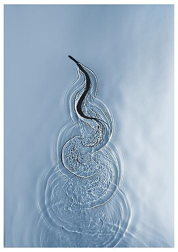
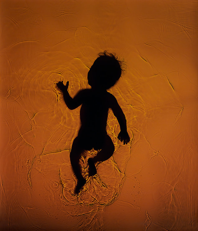
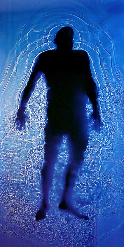
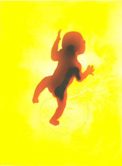
Adam Fuss -
Adam Fuss is a British contemporary photographer based in New York who is known for his interesting take on photograms; they take on themes of nature, living creatures and organic forms. The works are often in colour on a silver gelatin print medium such as the images of snakes and babies as seen below - theses works interest me in particular as they leave me wondering how they were made. For these pieces, Fuss uses a suspension of silver salts in gelatin for crisp and high quality prints. I was also intrigued as to how the shape of the snake and babies in water were documented and I discovered that these are done using a water box within which the subjects lay and light is shone through to produce shadows and silhouettes.
Fuss began exhibiting his work in the 1980s and has claimed that his work in the darkroom is of the highest importance to him. As the outside world plays no role in the process, the photographer believes 'the camera-less image is more intimate... it's made, not taken.' I would agree with this statement and would support it with the idea that the photographer is never certain of what outcome will be produced unlike the trustworthy and more consistent digital photography. As well as this, the time periods under the light and in the developer are a variable controlled by the photographer so a print may vary drastically in tone and contrast to another print despite having the same content.
Fuss began exhibiting his work in the 1980s and has claimed that his work in the darkroom is of the highest importance to him. As the outside world plays no role in the process, the photographer believes 'the camera-less image is more intimate... it's made, not taken.' I would agree with this statement and would support it with the idea that the photographer is never certain of what outcome will be produced unlike the trustworthy and more consistent digital photography. As well as this, the time periods under the light and in the developer are a variable controlled by the photographer so a print may vary drastically in tone and contrast to another print despite having the same content.
METAPHORICALLY I STEPPED INTO THE CAMERA... AND I'M STILL THERE.' - Adam Fuss on his career in the darkroom.
Making a pinhole camera -
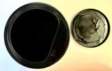
To begin making my pinhole camera I purposefully selected a container that would be easy to make light proof so as to successfully produce prints that aren't over exposed. I used a tin can with a plastic lid which would later be pierced in order to let a controlled concentration of light in. I then spray painted the entire interior of the can, including the slightly translucent plastic lid. I had to do this several times to ensure that the colour was completely opaque.
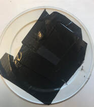
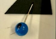
Next in the process I used a pin to delicately pierce the plastic lid to make my lens. According to my research, I had to be careful to keep the diameter of the hole smaller than the diameter of the main body of the pin, so I know that not too much light will be let in. However, this method did not work well as the plastic was thick meaning the whole pin had to be pushed through in order to properly pierce it and this made the hole to wide. To fix this I cut out a rectangle in the lid and replaced the missed area with a bit of a can that I cut out and prepared a lens for. I ensured no light was let through any gaps using black tape. I then made a shutter using black card and tape that was stuck down when closed.
|
|
|
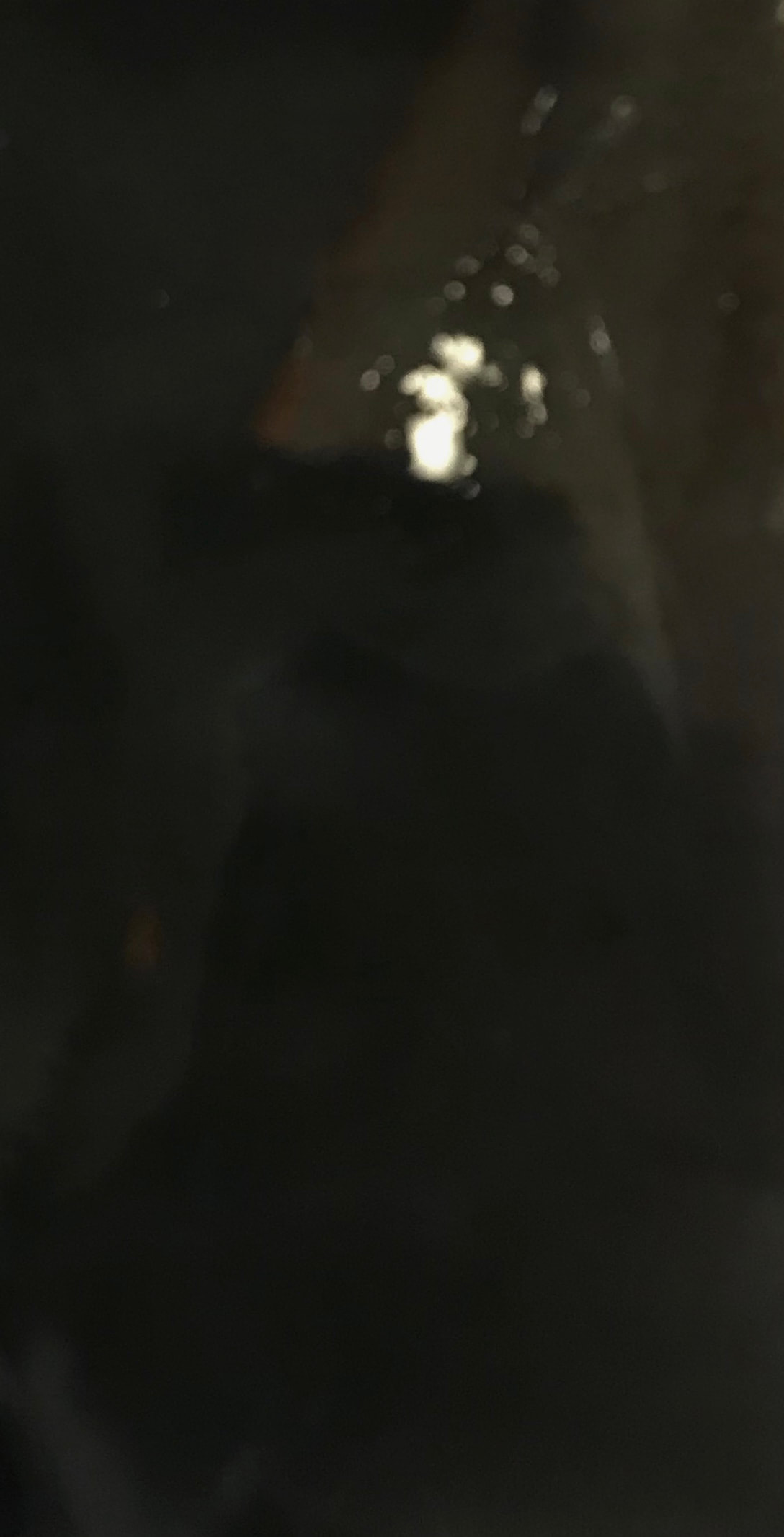
The prints above were produced using the pinhole camera that I made. The first photo is very murky and clouded however the light rectangle on the left that is present clearly depicts a light on the ceiling I was looking at. The exposure time was around 3 seconds and developing time was 2 minutes; the exposure was perhaps slightly too short as the only clear subject was the lightest area of the image and the rest is shrouded in darkness. The second print was done on a triangular piece of photographic paper as I wanted to experiment with photos being taken that aren't rectangular or square in shape. This print, like the last, was too dark to make out any subjects and this was the case for the third one as well. I suspected by the cloudy effect on these prints that the paper was slightly exposed before being used in the camera as they were difficult to develop and are hard to decipher. The fourth print was the most successful as you can clearly make out the shape of the building I was trying to photograph. This print had the longest exposure time of 8 seconds and a developing time of 2 minutes. I am happy with how this print turned out due to its clear depiction of a building but its element of mystery and a dark mood as a result of the process. From this, I can say that my pinhole camera was a success.
|
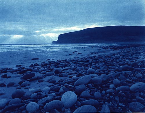
Making a Cyanotype -
WHAT ARE CYANOTYPES -
A cyanotype is a form of photograph created using a photographic printing process to produce a cyan coloured image. They were popularised by the works of Anna Atkins, Henry Peter Bosse and Mike Ware throughout the 20th century and continue to prevail amongst the studies of many artists and photographer to this day. By preparing photographic paper with Ferric Ammonium Citrate and Potassium Ferricyanide, the surface is suitable to leave in the sun with a negative or other materials that are then imprinted in reverse. This method can be used for scientific purposes such as the way in which Anna Atkins worked or for more artistic outcomes as seen in the photographs developed by Mike Ware.
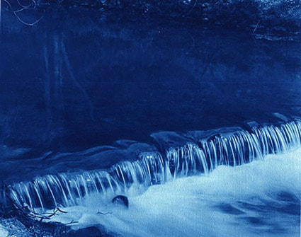
MIKE WARE -
|
Mike Ware is a Bromley-born, British photographer and chemist who adopts a new cyanotype process in his works in order to produce beautiful Prussian Blue images. By tweaking the traditional methods seen in works such as Atkins and Bosse, Ware is able to eliminate challenges faced previously so his prints are to the best standard they can be. An example of this is during the rinsing step many of the soluble colours are washed out so as a solution, the photographer removes the majority of potassium ions from the sensitiser which he says also eliminates issues such as stained highlights, growth of mould, inconsistent drying and long exposure times. Another idiosyncrasy of Ware in his work is the careful selection of paper that is chosen based on stability of the coating of chemicals, tendency to decompose and the overall aesthetic of the work. Focusing on subjects in nature, Mike Ware develops intricate cyan blue prints that for me connote water, tranquility and solitude.
|
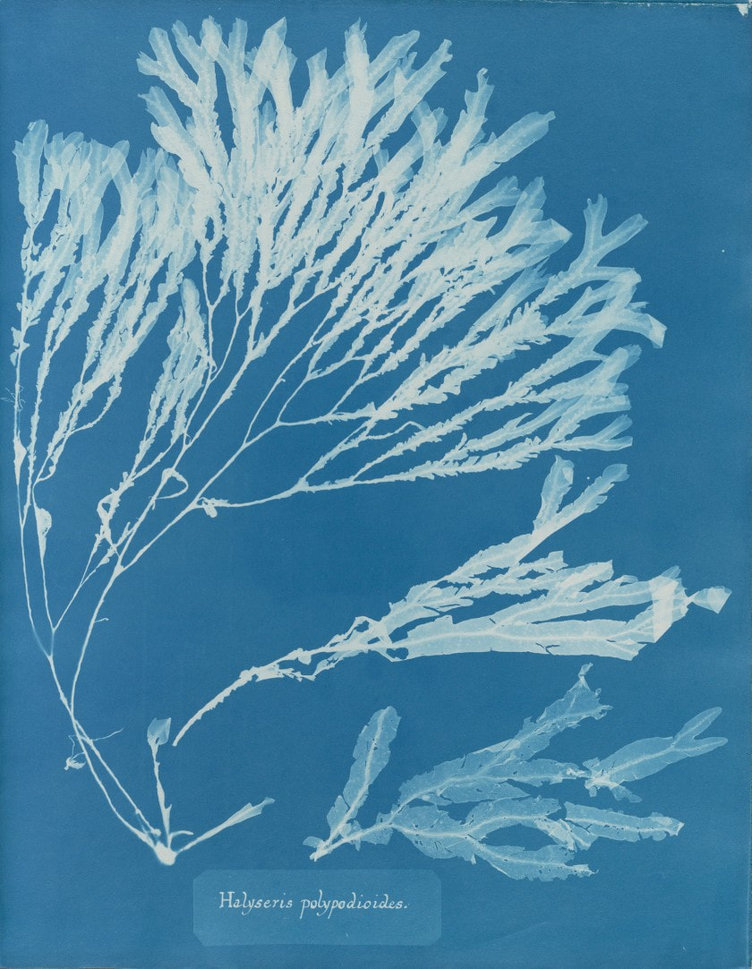
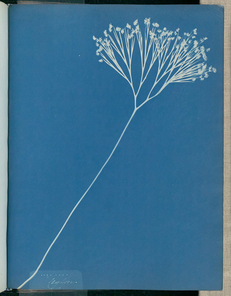
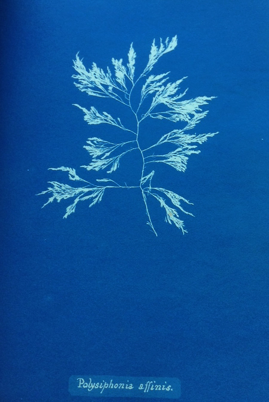
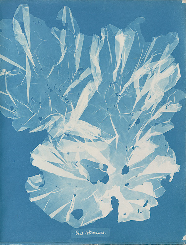
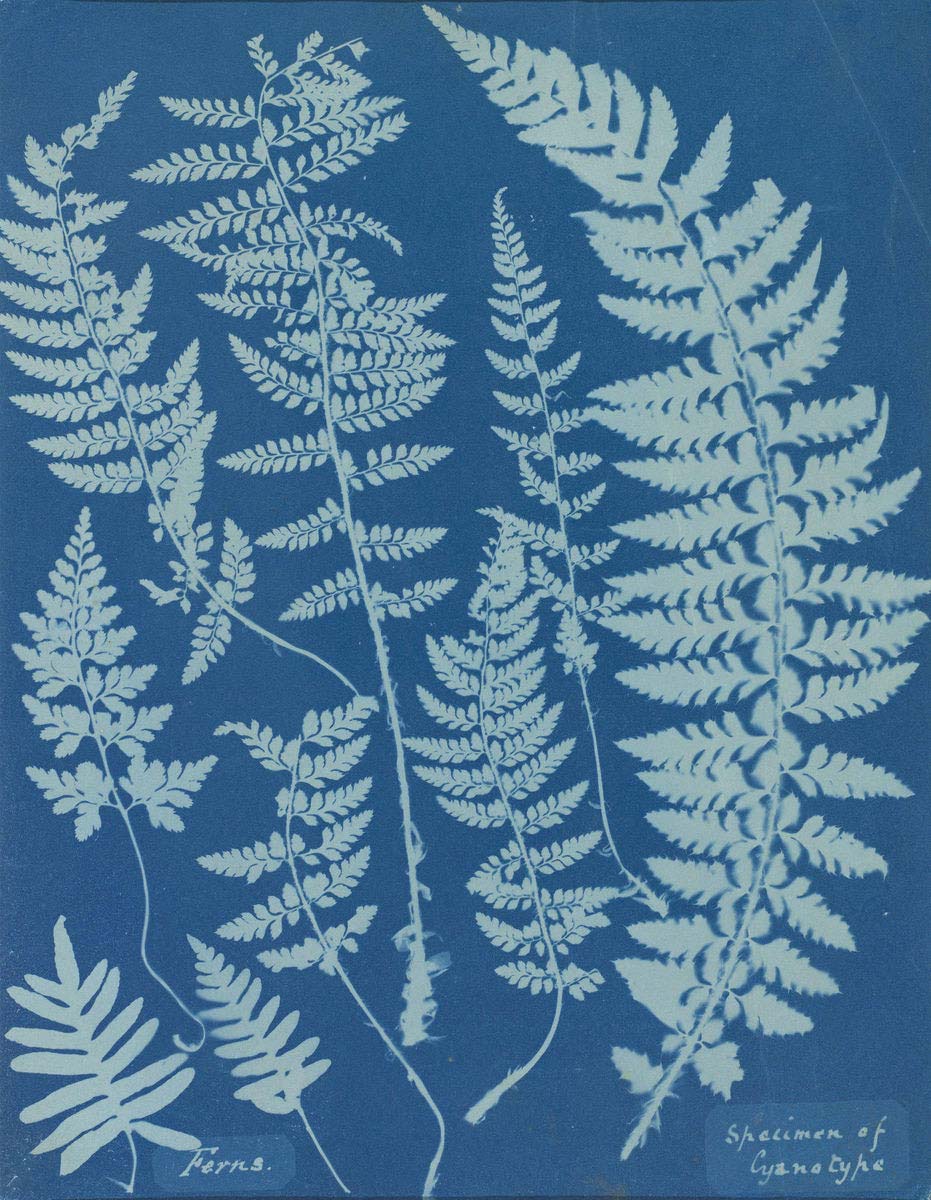
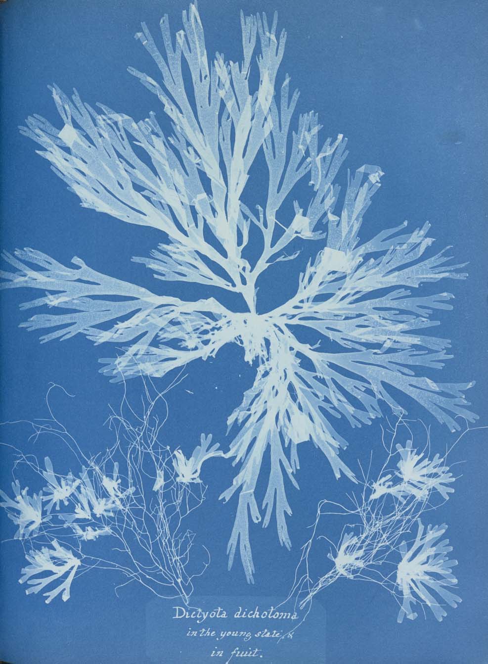
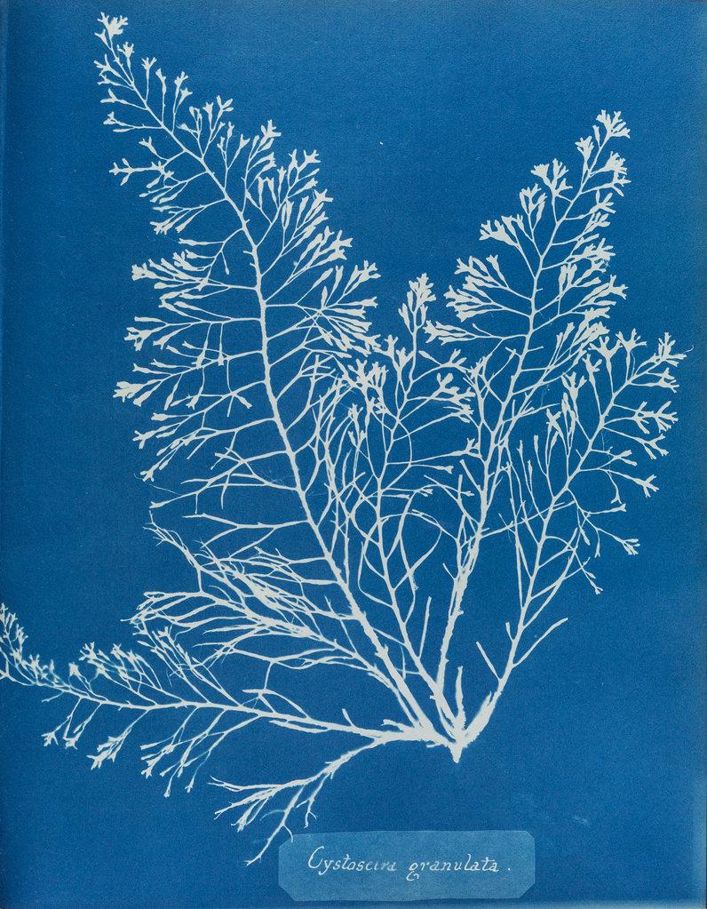
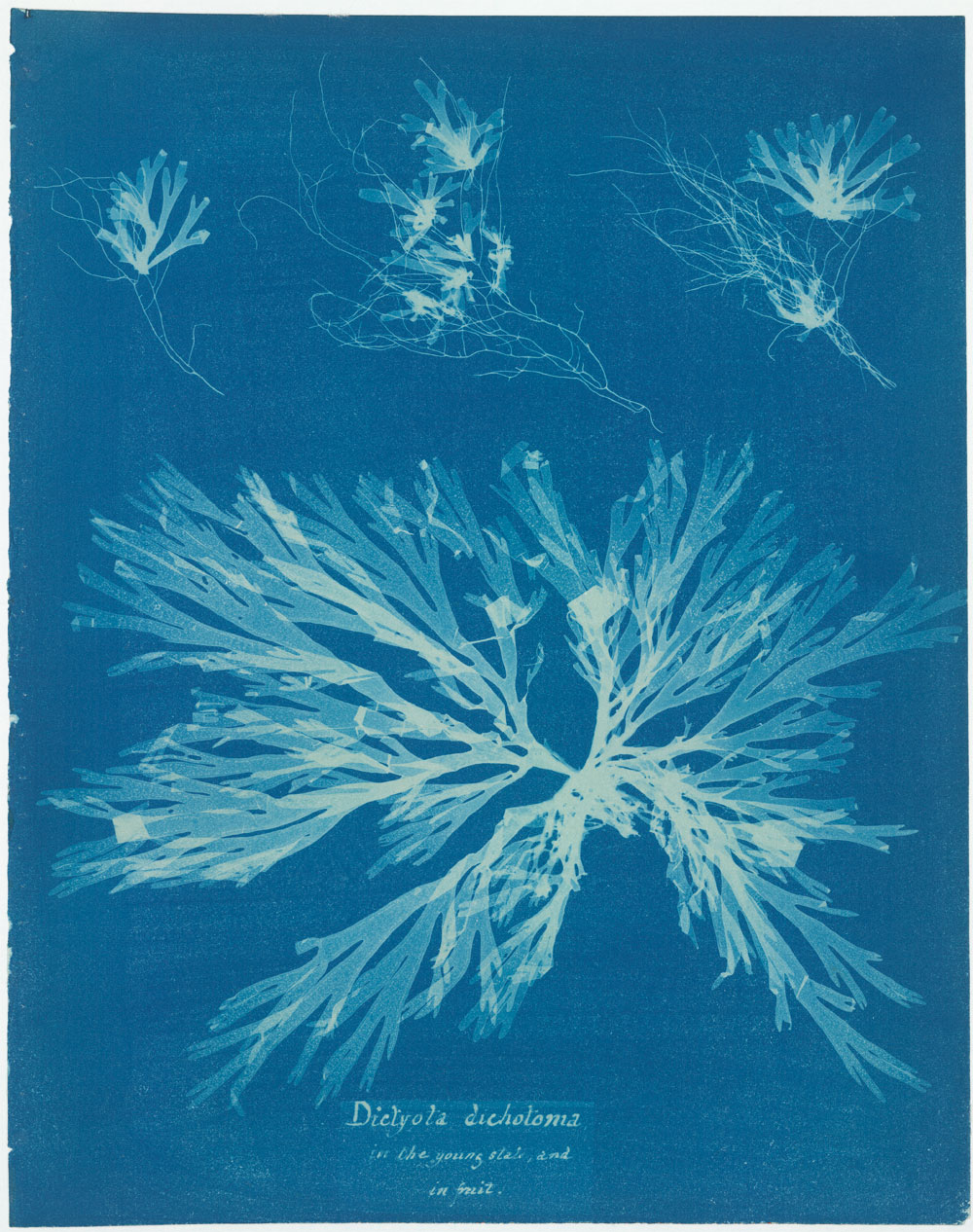
ANNA ATKINS -
Anna Atkins was a British botanist during the 19th century and is known by many as the first female photographer, following the production of her book 'Photographs of British Algae', in which she uses cyanotypes as forms of photographic documentation. The book was extremely useful at the time when other forms of photography were yet to be discovered and popularised, and the traditional method of scientific documentation entailed hiring an illustrator to draw or paint the subjects. This however was less desirable as it is based on interpretation an is not an accurate depiction of the algae. Using cyanotypes, however, is indexical, meaning there is a direct relationship to the images produced and the thing that is being shown. The photobook served a scientific purpose and was not published for commercial use, perhaps suggesting why for so long Atkins was not recognised as a photographer, along with the worrying state of the patriarchal society at the time that may have disregarded her success. Being in a collection of only 13 copies, the photobook is now considered particularly important, along with the photobooks 'Cyanotypes of the British and foreign ferns' (1853), and 'Cyanotypes of British and foreign flowering plants' (1854), which were coauthored by Anne Dixon.
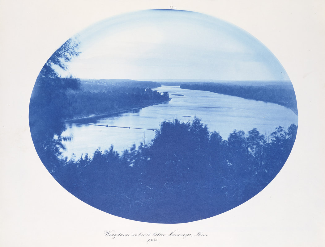
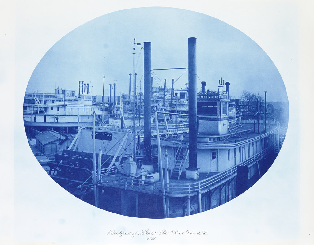
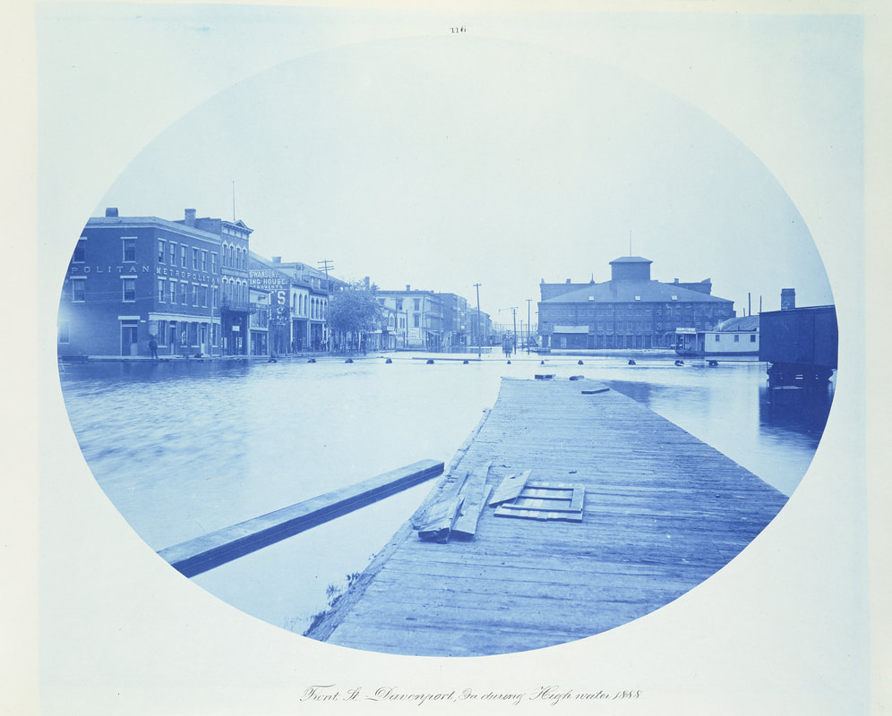
HENRY PETER BOSSE -
|
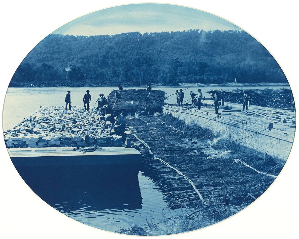
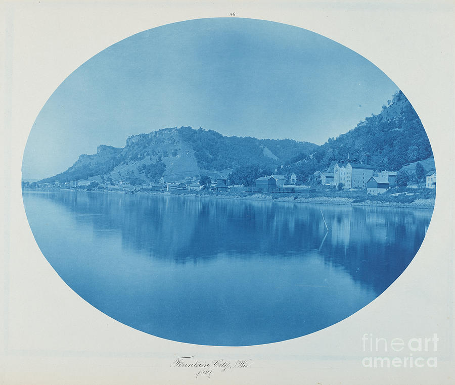
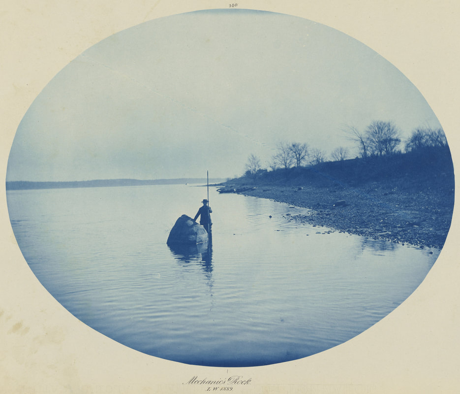
Henry Peter Bosse was a German cartographer and engineer who is now recognised as the most important photographer of the Mississippi River throughout the 19th century. During his time as an Engineer in the U.S., Bosse created drawings, maps, photographs and cyanotypes all documenting the course of the River and providing reliable economical resources for his studies. These were later made into books such as Views on the Mississippi and exhibited at the Smithsonian museum in Washington D.C as well as selling for hundreds of pounds to private collectors and buyers across the world. Taken from 1883-1893, the hundreds of cyanotypes produced by the photographer follow the course of the Mississippi from Minneapolis to St. Louis, from being a natural structure in itself to being home to boats, docks, trading points and highways. The development of Bosse's work is important as it captures the evolvement of society at the time and perfectly describes the processes of industrialisation and urbanisation.
I am less fond of the cyanotypes created by Bosse than those created by Anna Atkins and Mike Ware as they have less vivid colours and a lower level of detail. What I liked about the works of the other artists were their distinct blue tint that is more subtle in Bosse's photos. However, I am interested in the oval shape as it strays from the typical rectangular frame of which are present in the works previously seen. |
MY RESPONSE -
Following my research, I had a go at making my own cyanotype using objects from my bag along with other items that I thought would create interesting results, such as the triangular wood and the jar lid. The first step is mixing Ferric Ammonium Citrate with water in a 1:3 ratio and separately Potassium Ferricyanide with water in a 1:10 ratio before mixing the two together under a dim light. An important detail that I learnt is that once coated, the paper is safe under tungsten light however should be kept away from sunlight until use, so as not to be exposed prematurely. The paper then needs to be coated in the solution, preferably using a foam brush for an even coat, and left to dry in the dark room until use.
Once placed under the sun with the objects on, I noticed my paper start to change colour, with lighter areas where the sunlight wasn't reaching. A problem that occurred for me was that the items found it hard to stay put on the paper and often blew away, making inconsistent and hazy prints. In hindsight I may have needed to use a glass sheet over the paper in order to keep it in place but this will need to be done with acetate, negatives or newspaper as they are flat enough to be squashed down. After leaving the cyanotype in the sun for around fifteen minutes I washed the paper to reveal that the colours had reversed. The next step is to fix the print however as this wasn't readily available to me I missed out this step meaning that my cyanotype faded. I also feel as if the step before this where I rinse the paper in water played a role in fading and softening the image so if I were to try making one again, I would skip this part. Overall the process of making a cyanotype proved successful however there are steps that I would need to adjust if I wanted to create a cleaner outcome.
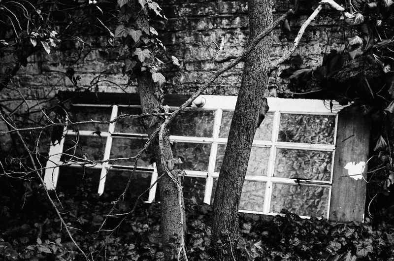
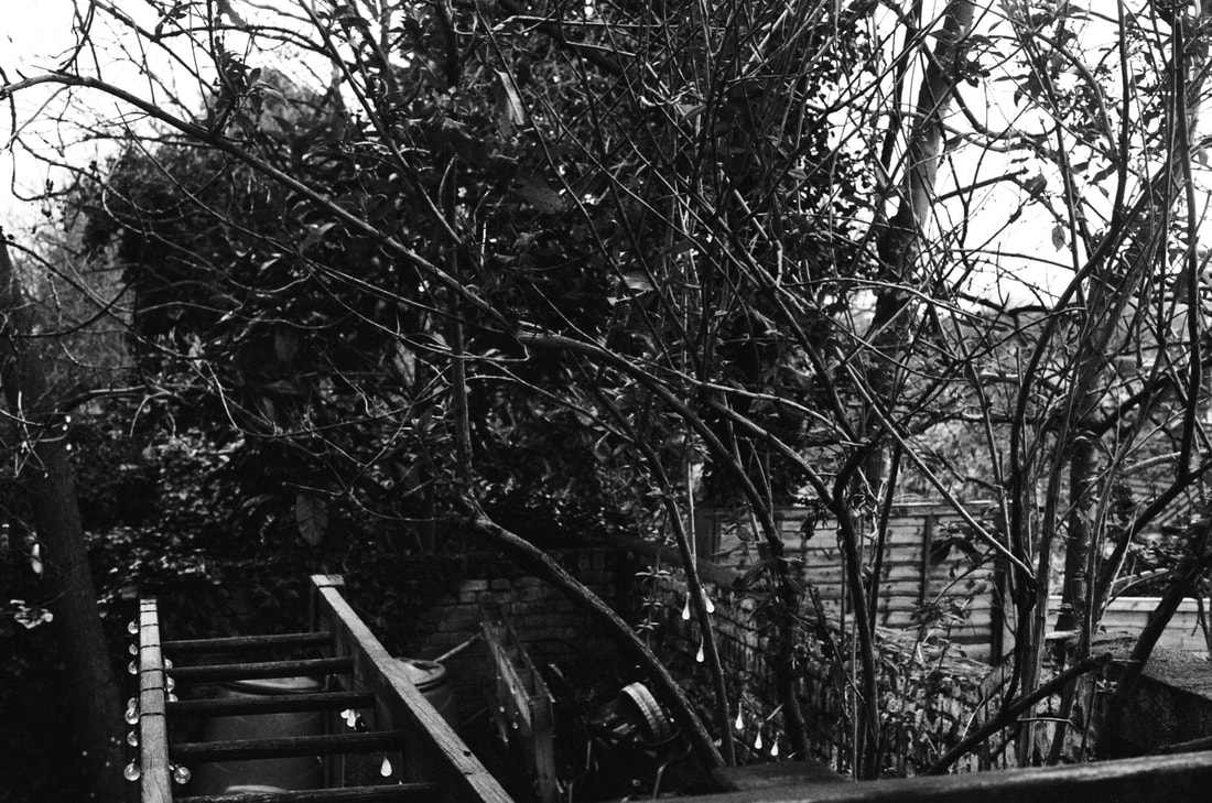
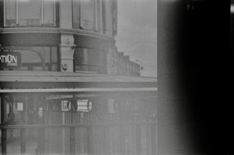
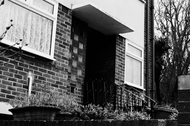
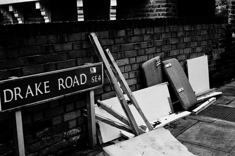
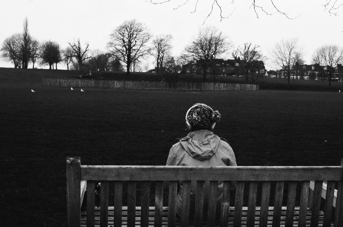
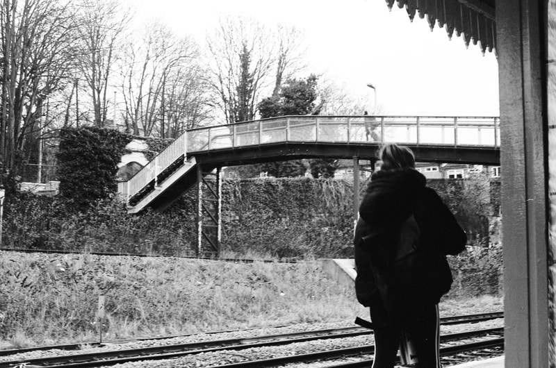
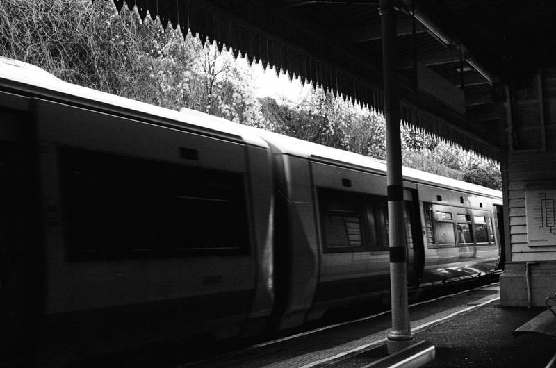
Using Black and White Film -
DIGITAL RESULTS -

|
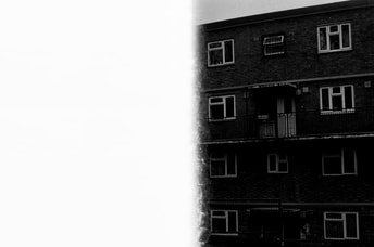
Using black and white film in a Pentax camera, I conducted a photo shoot throughout my home and local area. As there is always an element of unpredictability when working in film, I was aware of the fact that upon being developed, many of my photos wouldn't turn out how I'd hoped or expected. An example of this is the photo of a block of flats (Figure 22) in which half the photo has been overexposed and is completely white. Although this wasn't my intended outcome, I like the way the simplicity of the white left hand portion works against the cmplicated bricked building, and the leading lines evident in the right side and division of the image work together almost creating the illusion of an opened book.
|
|
|
|
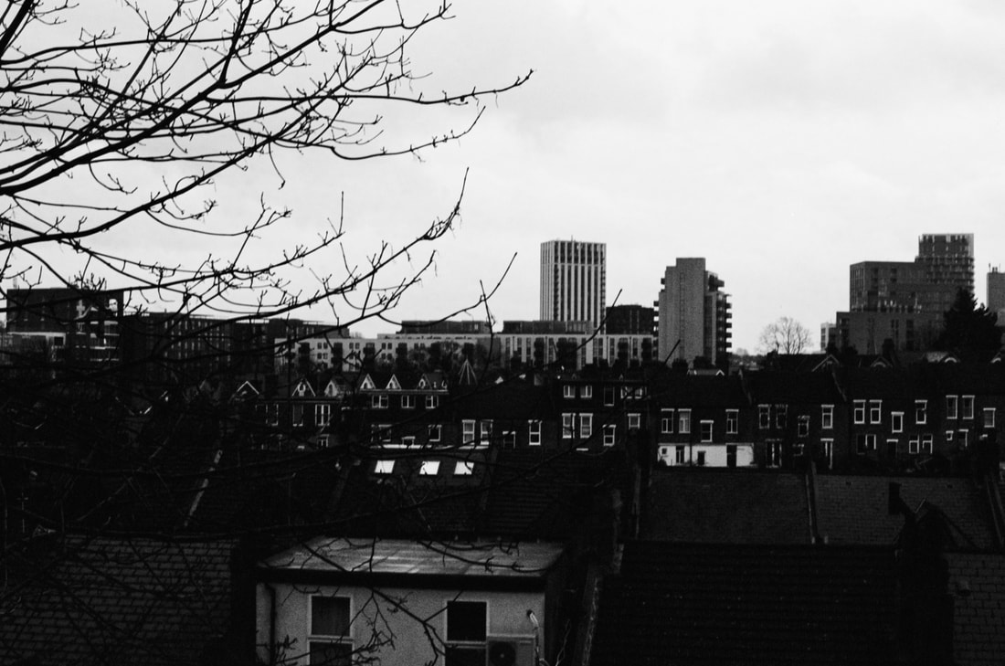
As seen in figures 20 and 21, the film has been exposed in such a way that they almost look inverted and grainy; this accidental effect grants the photos of Kentish Town with a dated finish that are reminiscent of 18th century Gothic Literature - this is supported by the lack of colour.
|
|
|
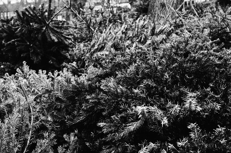
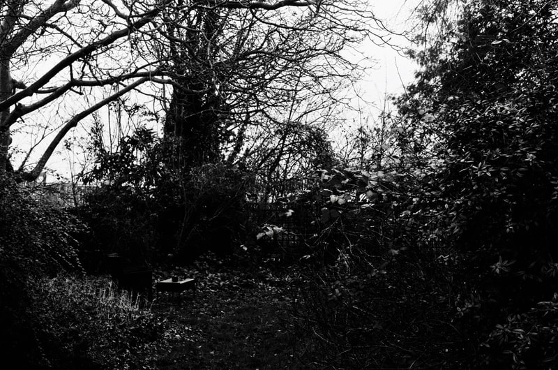
Figures 1,2, 4 and 6 can be recognised for their crisp finishes and elegant depictions of my garden and my local park. I like the noise that has been created by the abundance of shrubbery and plants ; as the typical green colour isn't present in the photos they make less sense aesthetically and therefor create the illusion of being more textured. This is particularly evident in Figure 1, a photo of old Christmas trees as the entirety of the frame are small pine needles and branches. In figure 1, the lack of colour mimics the subject matter - Christmas is over and the light and colour from decorations are drained from people's homes. It is a portion of the year that is home to the aftermath of celebrations and everything feels as if it has been drained of its prior excitement therefore makes sense to be photographed in black and white; the finish is eerie and unfamiliar to us.
|
|
|
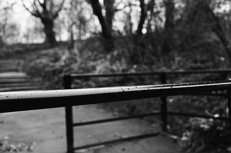
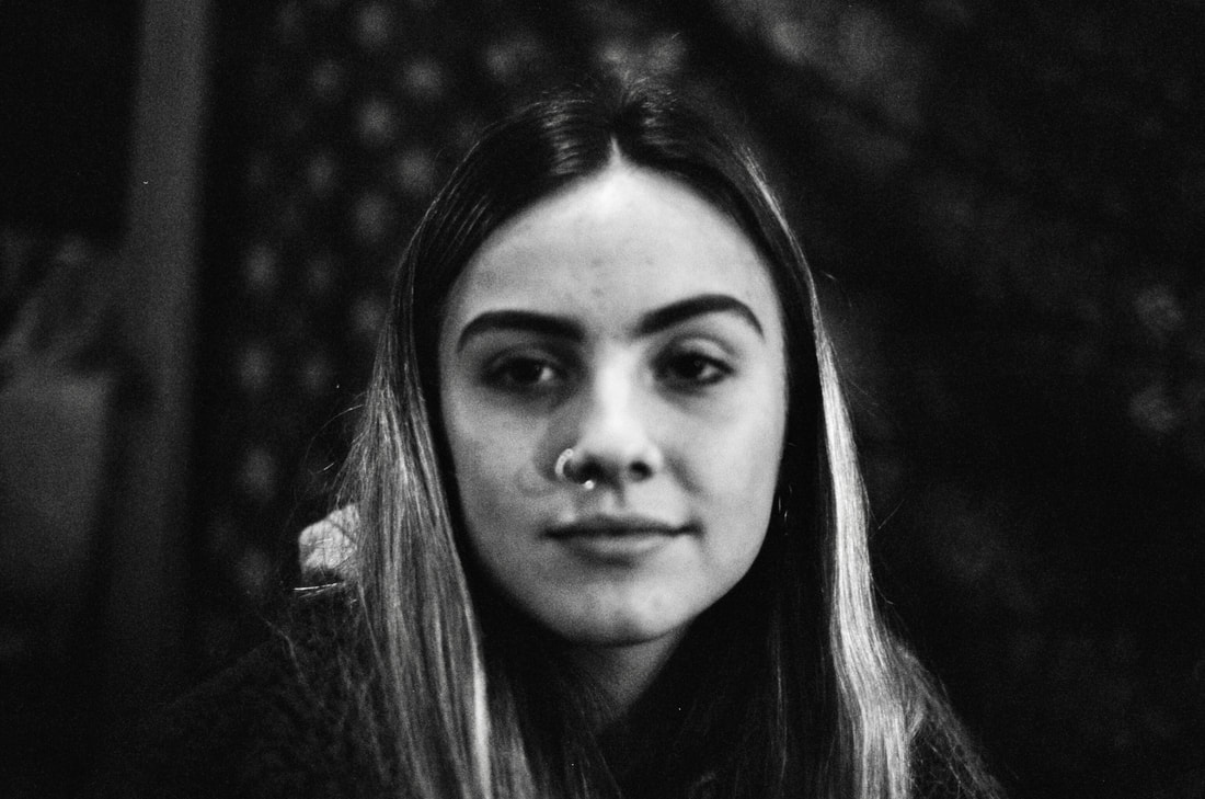
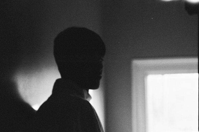
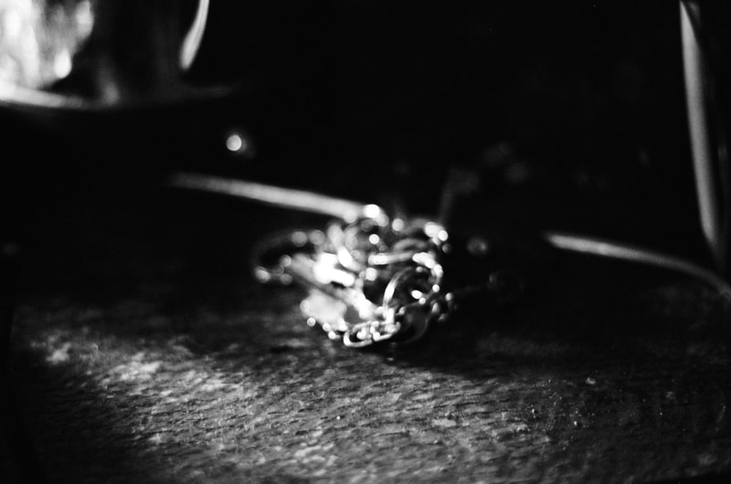
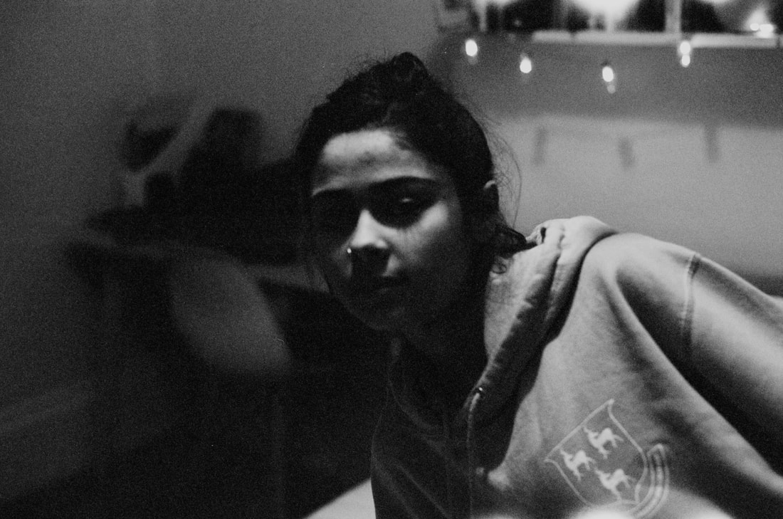
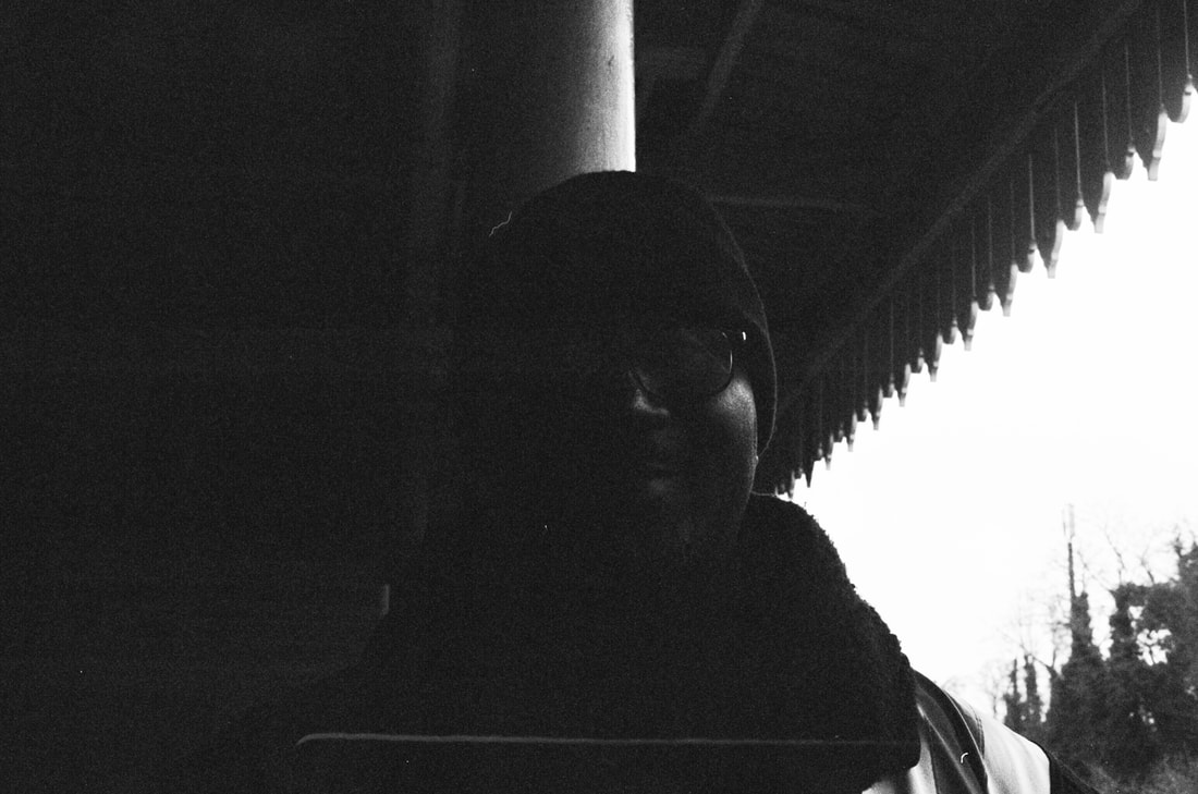
In terms of light, I would say that Figure 14 and 17 have worked well as they play with shadows in order to express information. In figure 14 , a portrait, the subject is not much more than a silhouette, yet the highlights and shadows are what give him meaning, and give the photo some clarity. Figure 17 is very aesthetically pleasing as while the majority of the photo is submerged in shadows, the chain in the centre and a ray of light to the left build upon the eminence of the traditionally mundane object and its location.
|
|
|
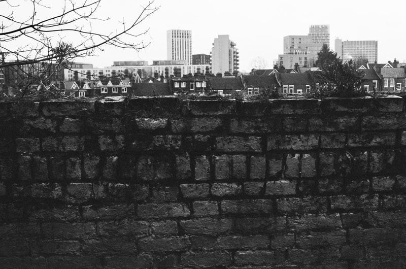
I would say that figure 5 is successful in terms of composition as the wall fills out a third of of the frame and the view in the background only receives a small portion; it is unprecedented that a photo of a landscape may be obscured by something less interesting and attractive. In this way, I could say that my work relates to that of Martin Parr, as he tends to photograph things in unusual ways in order to skirt around his focal themes and ideas.
|
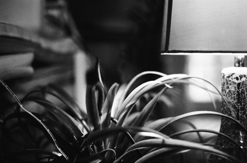
Lastly, I would like to draw focus to Figures 8.9,24 and 25 as for me they are scenes I am very familiar with so would typically be bored and uninterested by. However, due to being monochrome they are transformed completely and I am able to look at them in a different way. From my point of view, colour can often disrupt one's perspective as it can easily change the meaning of an object. As it is the easiest thing to see, we are often persuaded to let it take full influence on our outlooks of photographs so by eliminating this problem, it is less difficult to take notice of form, composition and structure. This is essentially what I have aimed to capture in Figures 8.9,24 and 25 as I have encouraged myself to drift from my typical methods of taking photos. Figures 8 and 9 have a shallow depth of field which works with the subject matter as they are unusual trinkets that I want to draw attention to instead of overlooking with a larger distance. Overall, I feel this was a successful shoot and to advance from this point I would like to try experimenting more with film and the negatives used to produce the photos.
MAKING A CONTACT SHEET -
|
|
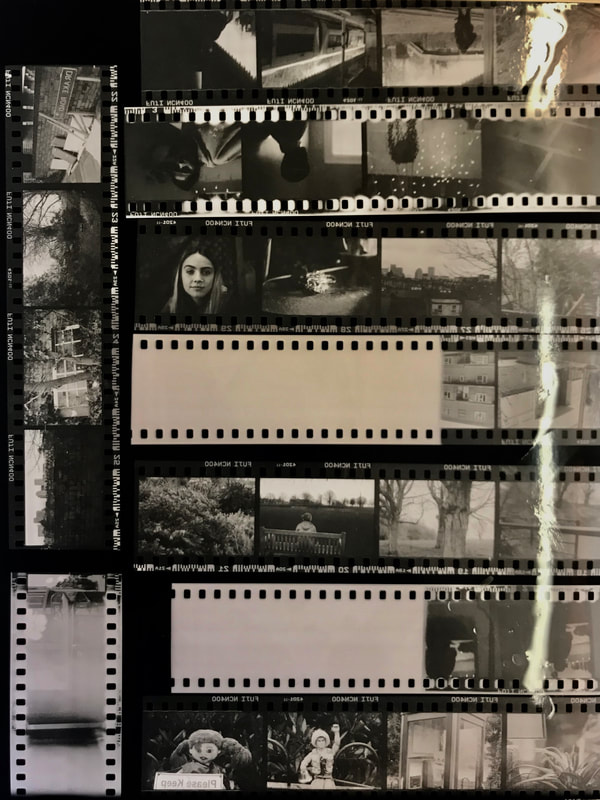
Using the negatives from my black and white film photoshoot, I made a contact sheet in the darkroom. I did this by arranging the strips so that they would all fit onto one piece of paper. I then lay them onto the paper and covered them with a sheet of glass that would ensure everything was flat so a crisper finish would be achieved. I then exposed them and developed them. I am very happy with the contact sheet as they are an easy way to look at all my photos and the quality of the print is very successful. This is due to its high contrasts that allow to images to be seen clearly. The strips and sprocket holes also work nicely as they create more contrasts and are a subtle reminder of the lack of digital technology involved through the entirety of the process. From here I would like to look at developing individual photos and use trial and error to produce the best outcome possible.
PRINTING NEGATIVES -
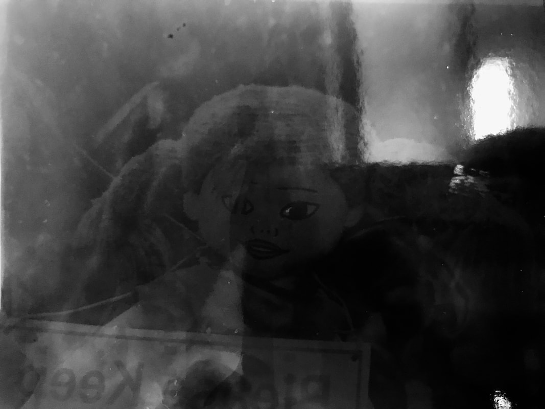
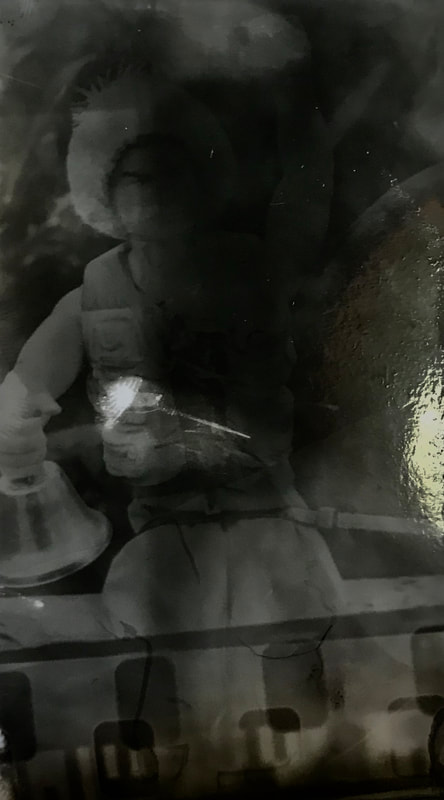
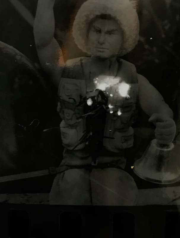
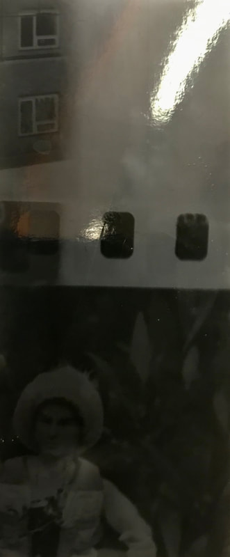
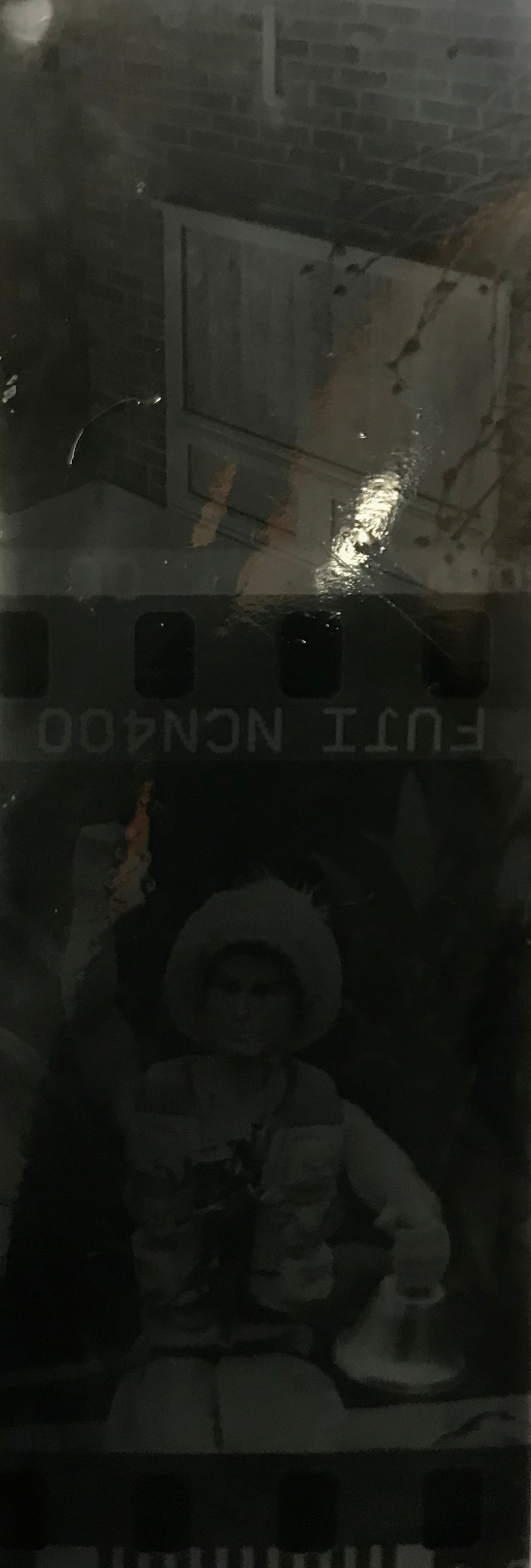
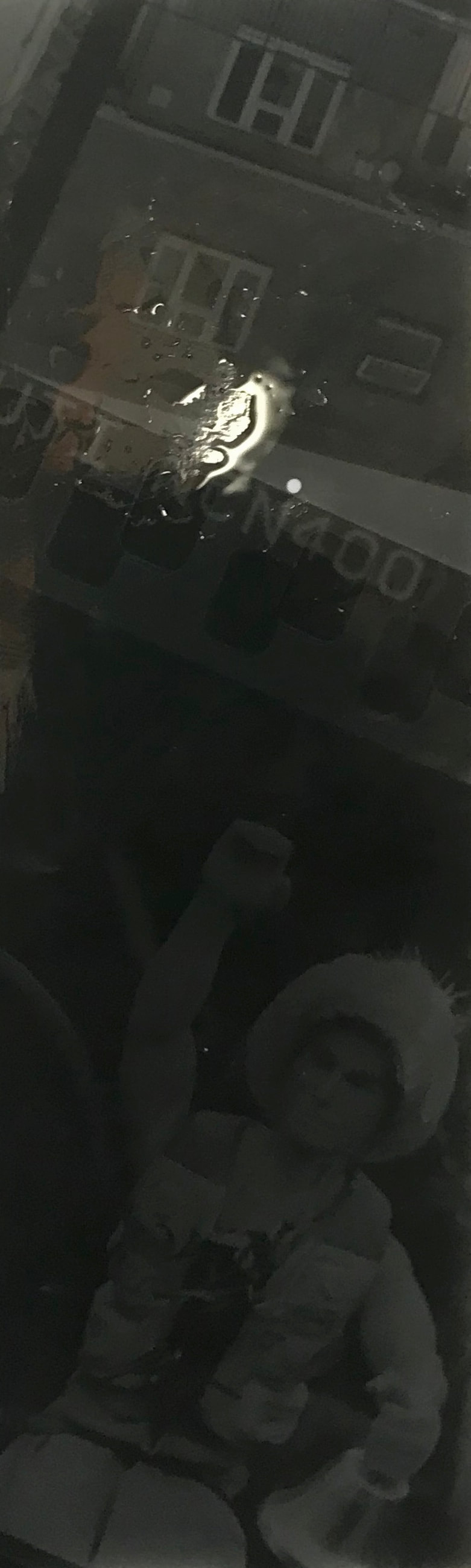
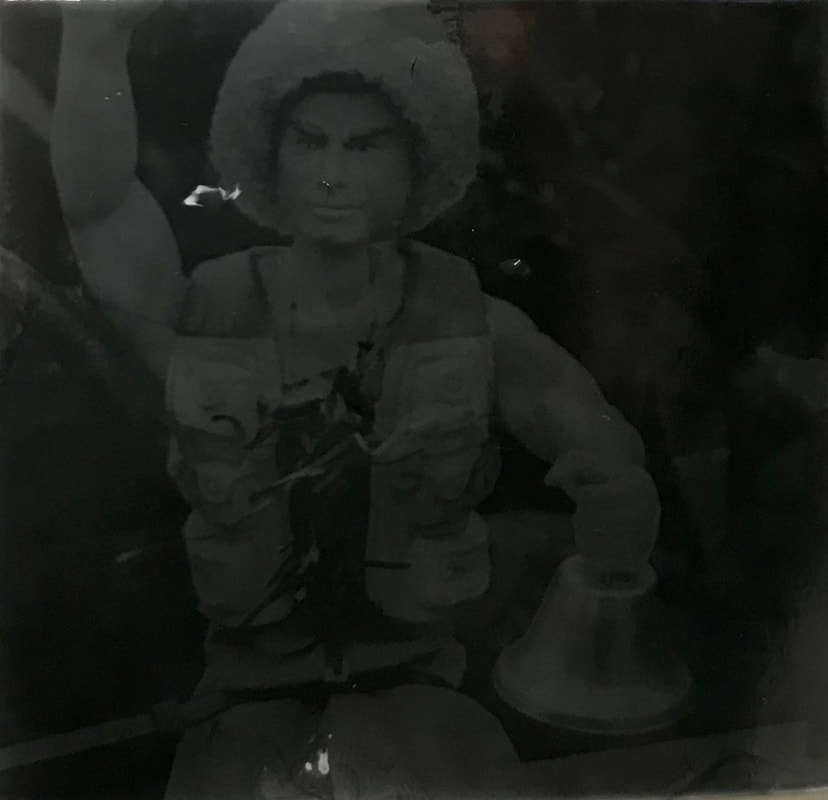
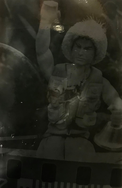
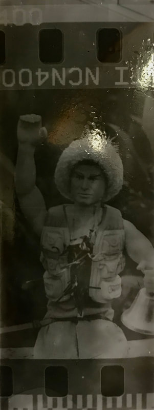
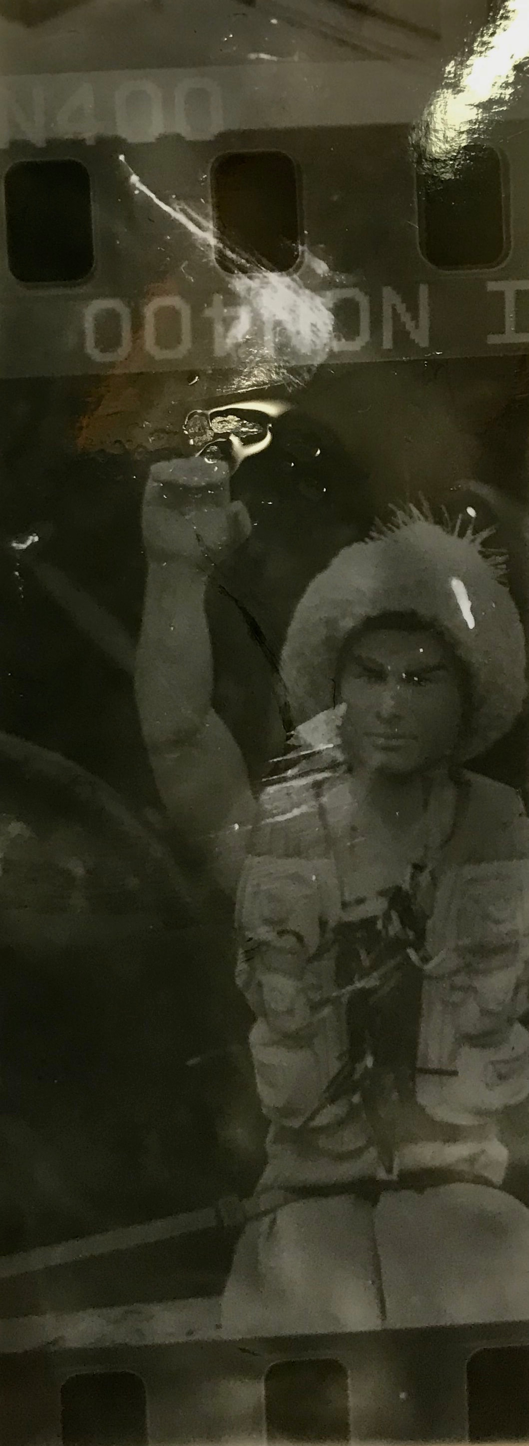
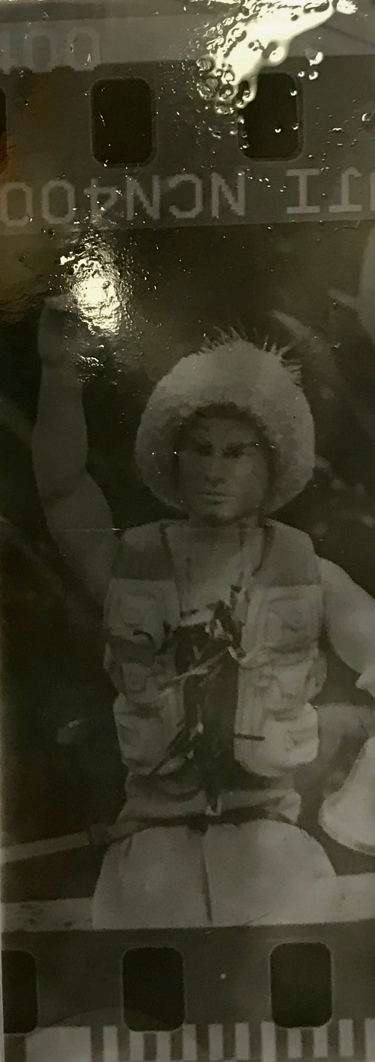
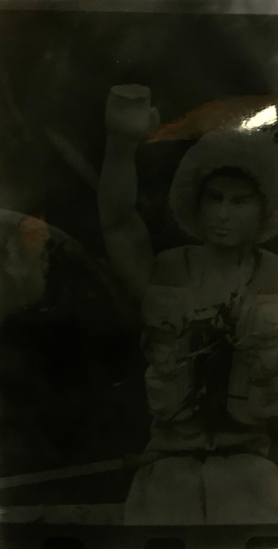
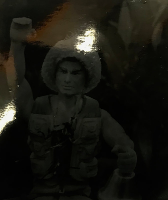
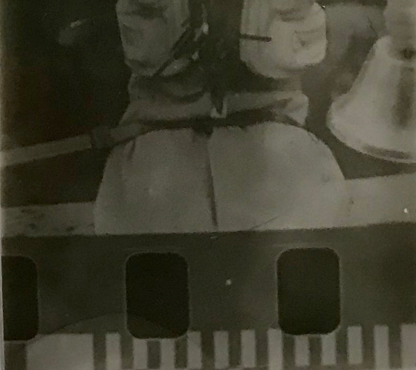
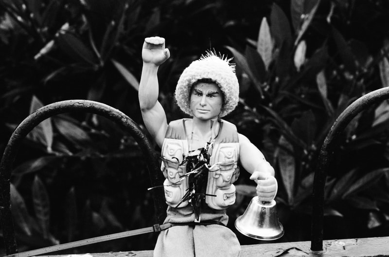
Taken from my black and white film photoshoot, I did a series of prints in the darkroom. For this process I put a negative in an enlarger before exposing the photographic paper underneath the blown up image and experimented with different exposure times. I also experimented with using more than one negative and making use of the sprocket holes that are visible on the edges of the film. I like this effect as it reminds us of the processes involved and gives me license to overlap and double expose photos. With an exposure period of between 1 and 10 seconds, I found that the most successful time was around 3 seconds, providing the exposure time was correct. For me, the most successful print was a small portion of a photo of a toy figure where there is a high contrast and good focus. It works as the image is easy to see and the dark black paired with the light grey tones enforce this easy depiction. Another print that I found to be successful was a long strip that documented a portion of two negatives as well as the sprockets and space between them. The sprockets make for a heavy contrast whilst the images are successful in terms of exposure. Doing tests on small pieces of paper on small sections of the negatives inspire me to look at the effects of creating one image chopped up into different areas which is what I would like to explore further for a final piece.
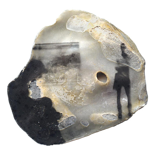
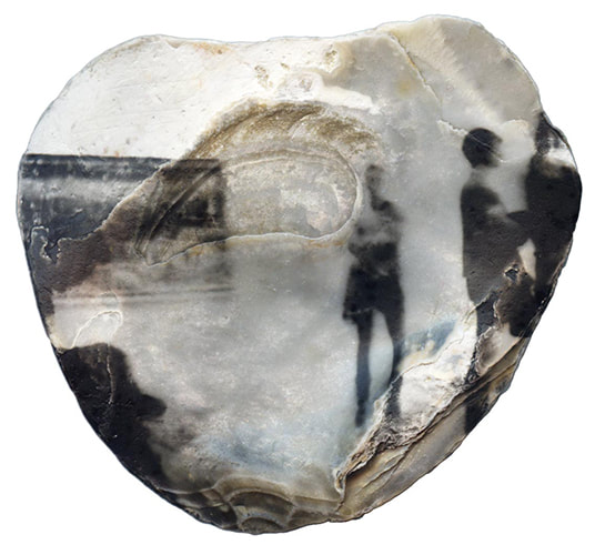
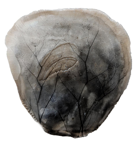
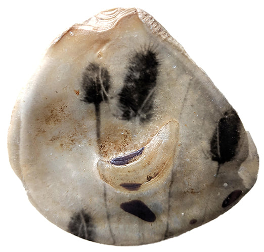
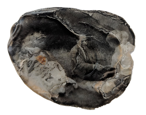
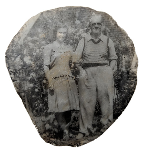
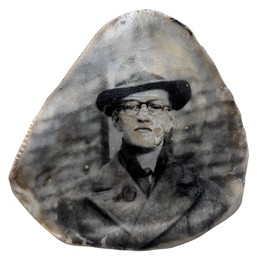
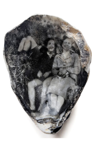
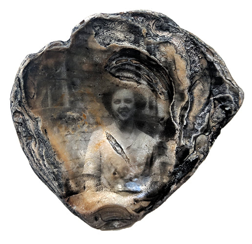
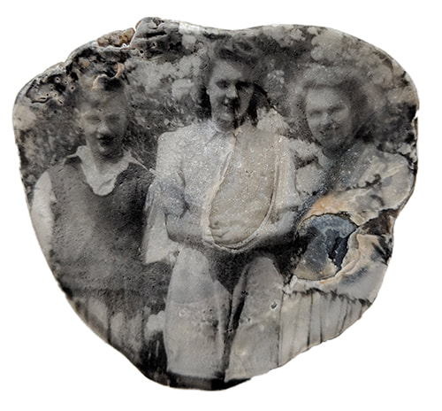
Tina Rowe -
|
Tina Rowe is a practicing artist whose work has won her winner of the Denis Roussel Award 2019 for her Oyster Shell Ghosts collection and countless exhibitions across the world. Despite much of her work taking life in the darkroom and with the use of photographic methods, Rowe doesn't consider herself a photographer but a figurative and literal mark maker whose 'marks are what [matter]' to her.
For this series Rowe collected a number of images from different sources; the plants are reclaimed negatives from instant film; the people are one second hand held exposures from the Bonnard exhibition and were taken with little care with the camera at hip height and at a 15 degree angle. Interestingly, none of the images in this shell series were taken with the intent of being placed onto shell however I love the effect that has been created by them and they look entirely intentional. There is a sense of solitude within the shells, formed by the silhouettes of the faceless subjects and the softness of the shapes. The shells were prepared with liquid emulsion and images were printed onto them using an enlarger in the dark room. This process is one that I would like to explore as any subject can be printed onto any surface which combined can tell a story.
For this series, Rowe collected negatives taken by an 'amateur photographer' at a car boot sale. Due to her interest in working with disregarded objects, she bought these as a way of seeing into other people's pasts as she likes 'the literalness of printing a discarded thing on another discarded thing.' Her intention in this series was to encourage people to take a close look at the images which is easier to do when they are on an unusual surface such as a shell. She is encouraging people to take a look at the lives of others. The shells used in this series were collected from the River Thames many being hundreds of years old. For this reason they go hand in hand with their subject matter and create a new beauty from two faded and abandoned items.
|
Planning my Final Piece -
For my final piece I would like to explore further printing out negatives; in my previous experiments I worked with individual photos as well as a contact sheet. In terms of development, the. contact sheet was more successful as it was a high contrast and clear print. The prints that I did of small bits of film in an enlarger had less successful results as they were as in focus and were mostly over or under exposed. This meant the results were often murky and hard to see. Despite this, I would like to continue looking at smaller prints using an enlarger as I am interested in the idea of making loads of small pieces to create something bigger. I discovered this when I was using small pieces of photographic paper to carry out tests that would determine the exposure time for the negative. I like the way that many images can make up something larger, particularly if that overall image is compiled of lots of negatives. Another element of my test prints that worked well were the visible sprockets holes and the numbers and text on the film so by creating a collage of lots of negatives, I can include those details.
