What is Instruction Based Art?
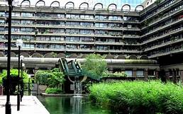
Originating 20 years ago, Instruction based art is whereby artists 'create' pieces through the means of another person. By setting often obscure instructions for the general public, they are able to produce personal and interpretive outcomes, whilst encouraging others to explore their creative sides. The concept explores people's willingness to comply with knowingly 'daft or dangerous' tasks based on the importance and credibility of whoever is setting them, arguably to expose the public's capacity to act as sheep. This is perhaps a statement from the likes of Ai Weiwei who implores us to disable a security camera.
A common controversy ponders the question Can an idea be art? which is a theme discussed throughout Instruction Based Art. For example, the artist produces the idea for a piece and it is carried out by other people such as the general public; although they are not themselves carrying out the work, it is their idea so I believe that is the real artwork. An artist may instruct somebody else to produce their work for them, perhaps if they are unable to do it - such as architecture or large sculptures - or they may be attempting to encourage people to be creative - such as Instruction Based Art. However this doesn't necessarily mean that the person whose idea is was is not an artist as they have not done the physical work, but rather they have come up with the idea so it is still their artwork.
Good art is not always skilful - arguably, good art doesn't always require technique or talent as in some circumstances the art is a statement as opposed to a showcase of technicality. Ai Weiwei's disabling a security camera for example is not explicitly demonstrating creativity, yet the context and significance of the instruction transforms it into art. Another example is the 60's movement of conceptual art, whereby the meaning behind the work holds greater importance than the finished piece. Likewise, the photographer doesn't always have to be the one to press the shutter; if the photo is staged, the photographer may come up with the idea for the photo and set up the scene, the actual act of taking the photo is not as significant as the idea behind it. A contentious example that opposes this idea is Naruto, the rare crested macaque monkey who won a two year legal fight over the copyright of a selfie it took on David Slater's camera.
Good art is not always skilful - arguably, good art doesn't always require technique or talent as in some circumstances the art is a statement as opposed to a showcase of technicality. Ai Weiwei's disabling a security camera for example is not explicitly demonstrating creativity, yet the context and significance of the instruction transforms it into art. Another example is the 60's movement of conceptual art, whereby the meaning behind the work holds greater importance than the finished piece. Likewise, the photographer doesn't always have to be the one to press the shutter; if the photo is staged, the photographer may come up with the idea for the photo and set up the scene, the actual act of taking the photo is not as significant as the idea behind it. A contentious example that opposes this idea is Naruto, the rare crested macaque monkey who won a two year legal fight over the copyright of a selfie it took on David Slater's camera.
I believe that what makes an interesting instruction is the sense of excitement, confusion and danger it evokes upon the person carrying it out.
The Do It project
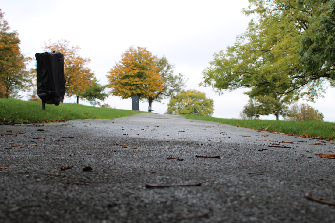
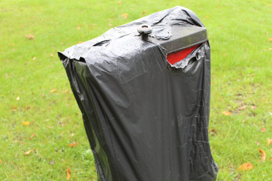
As part of The Do It project Sophia Al Maria encourages people to create mosaic like pieces using television broadcasts. Not only does she implore people to make these pieces, but she gets them to do it in such a way that utilizes the Fibonacci sequence to incorporate maths into the art; this allows for a unique set of responses that are random also to the 'artist' involved. I particularly like this project as the step that instructs us to take photos of the TV on a digital device produces a somewhat distorted and discoloured image, much like the quality of older televisions. On top of this, the many channels create a story of their own which reflects the devices delineation of which it broadcasts - the artist is retelling stories.
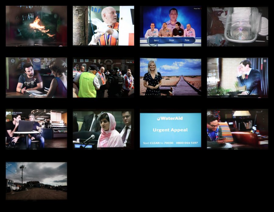


Sophia Al Maria (2012)
- Locate a television with a generous selection of satellite offerings.
- Utilize the fibonacci sequence of numbers to select channels in order
- 0, 1, 1, 2, 3, 5, 8, 13, 21, 34, 55, 89, 144, 233, 377, 610, 987 and so on.
- Alternatively use a fibonacci calculator.
- Take a photo with a digital device of each channel in passing.
- When you have exhausted your satellite channel options as prescribed
- by the golden ratio – collate the data in the reverse
order you have - collected it and compile into a mosaic.
- The resulting image is a simplistic representation of one edge of the multifaceted media matrix.
- Marvel at the stunning mediocrity of our manmade wonder.
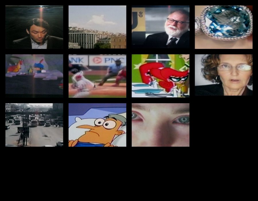
John Baldessari - Image Sequencing
John Baldessari's approach to image sequencing, with works conceived by the boredom of his late 60s, is one that often leaves uncertainty and unease. For example Man, Dog (Blue) leaves questions as to why the artist has chosen to colour the animal in blue and why the sea is above the boat, challenging normative concerns. We see in his later work that the artist enjoys creating tension between the juxtaposing themes in the pieces such as a table and a shark.
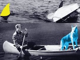
Man, Dog (Blue)
2002
2002
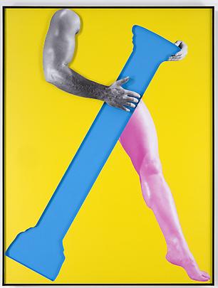
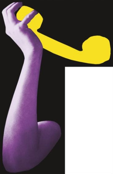
Arms and Legs
2007
Arms and Legs (Series) depicts, as the title suggests, arms and legs as collages often with interference of colour. Many of the works include red, green or purple arms in perpetually peculiar circumstances, separate from the rest of the body; I believe he does this to challenge expectations of the human anatomy whilst exploiting the boredom of which he claims inspired his later work. Each piece embodies an element of confusion as they are so often out of context or with no context at all as well as being interestingly put together and coloured.
My Response to John Baldessari
From John Baldessari’s List of Ideas: Fourteen disparate assignments
Assignment #5 One person copies or makes-up random captions. Another person takes photos. Match photos to captions.
Assignment #5 One person copies or makes-up random captions. Another person takes photos. Match photos to captions.
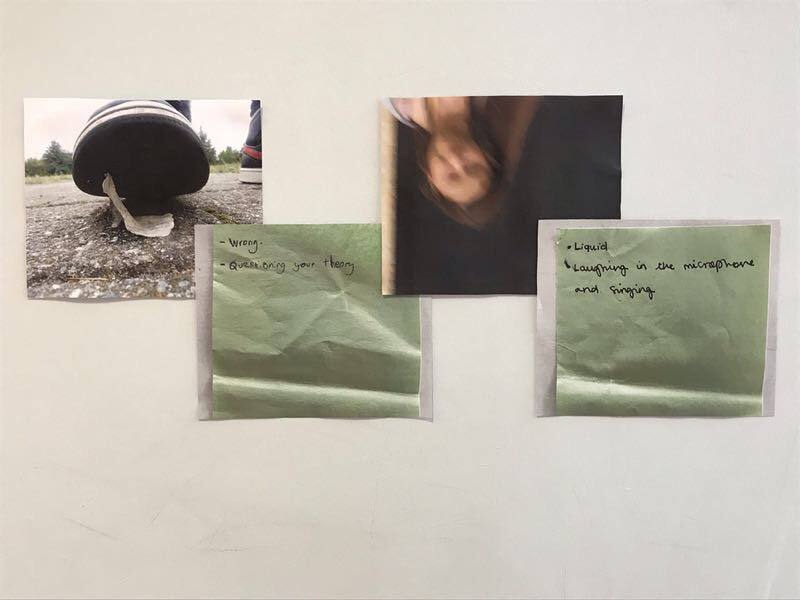
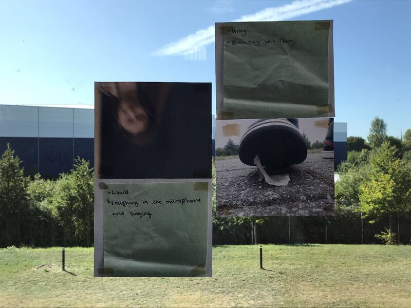
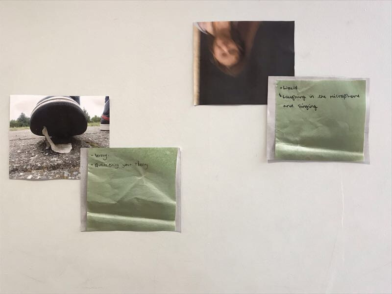
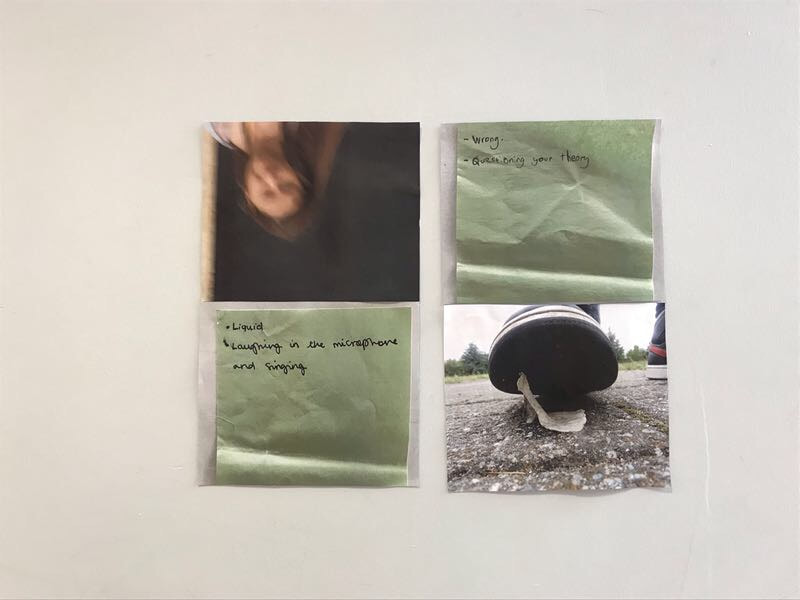
In response to Baldessari, I took a photo of gum stuck to the bottom of a shoe with the caption Wrong , whilst my partner photographed me with the caption Laughing in the Microphone and Singing. This was in an effort to create tension between the photos and captions whilst keeping them under a similar lexical field; the idea of gum stuck to the bottom of a shoe perhaps evokes a feeling of something being wrong and develops tension via this.
After our initial responses, my partner and I took a series of photos documenting our work alongside the captions they fit. We used diptychs for this yet some photos included both diptychs as together they created a similar tension to that in the work of Baldessari.
After our initial responses, my partner and I took a series of photos documenting our work alongside the captions they fit. We used diptychs for this yet some photos included both diptychs as together they created a similar tension to that in the work of Baldessari.
Reacting to Instruction Based Art
From John Baldessari’s List of Ideas: Fourteen disparate assignments
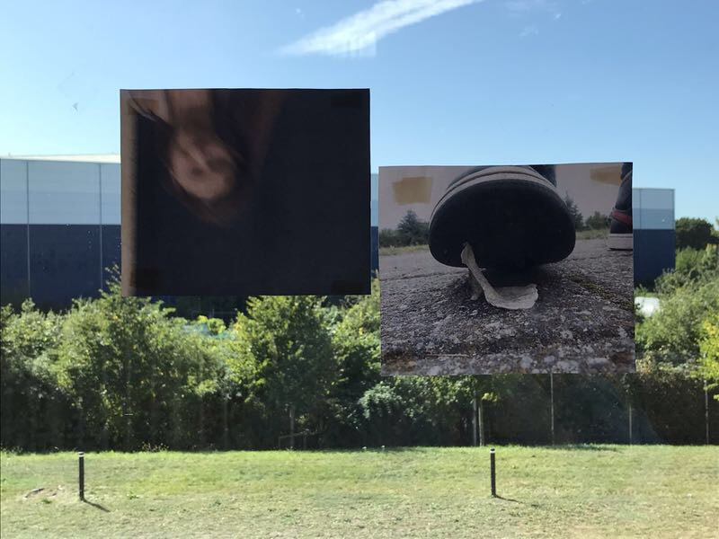
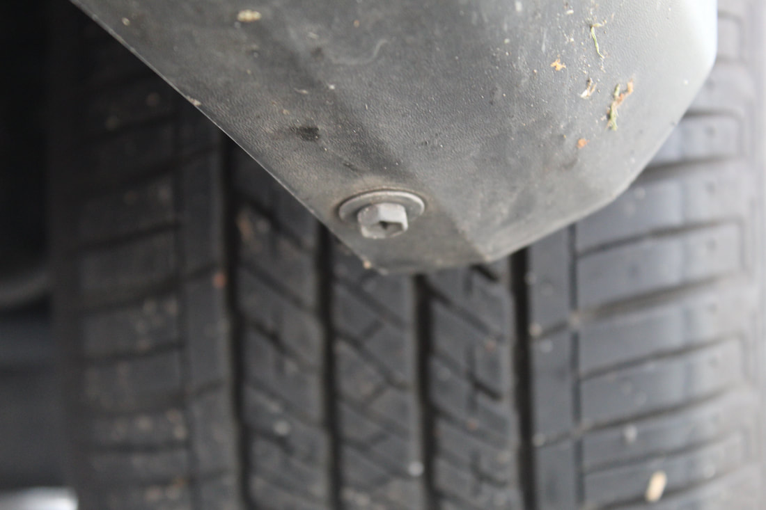
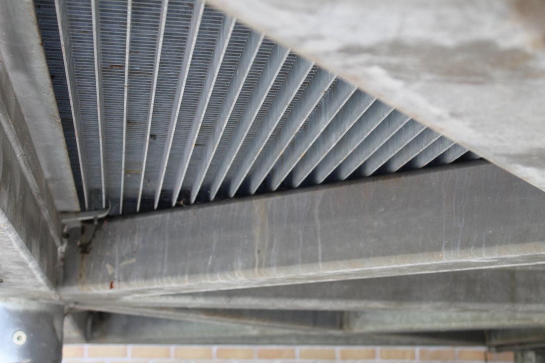
Assignment #10 Photograph backs of things, underneaths of things, extreme foreshortenings, uncharacteristic views. Or trace them.
Assignment #10 Photograph backs of things, underneaths of things, extreme foreshortenings, uncharacteristic views. Or trace them.
|
|
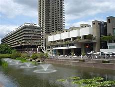
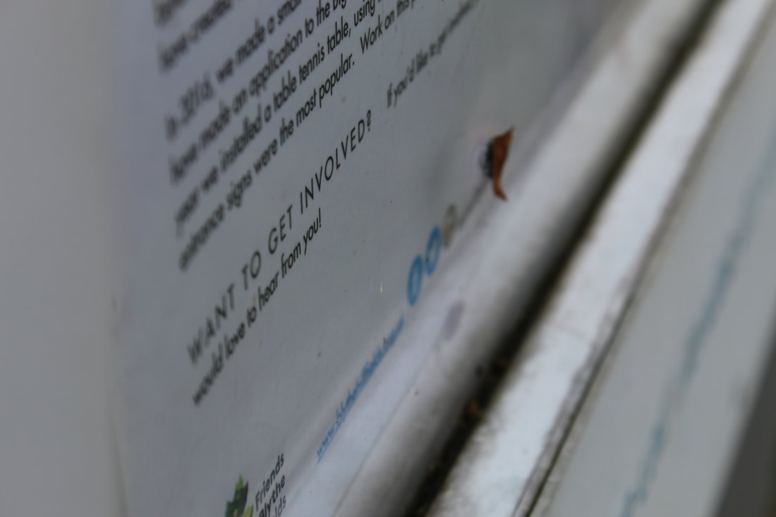
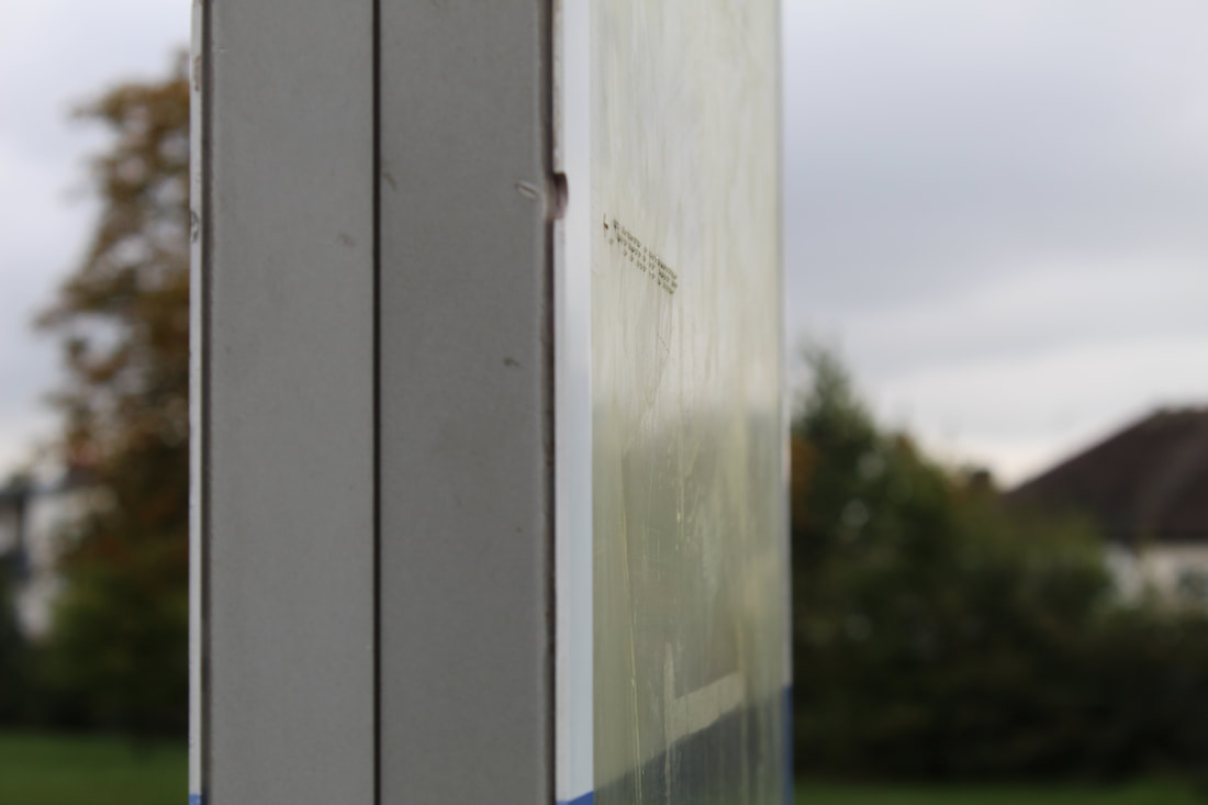
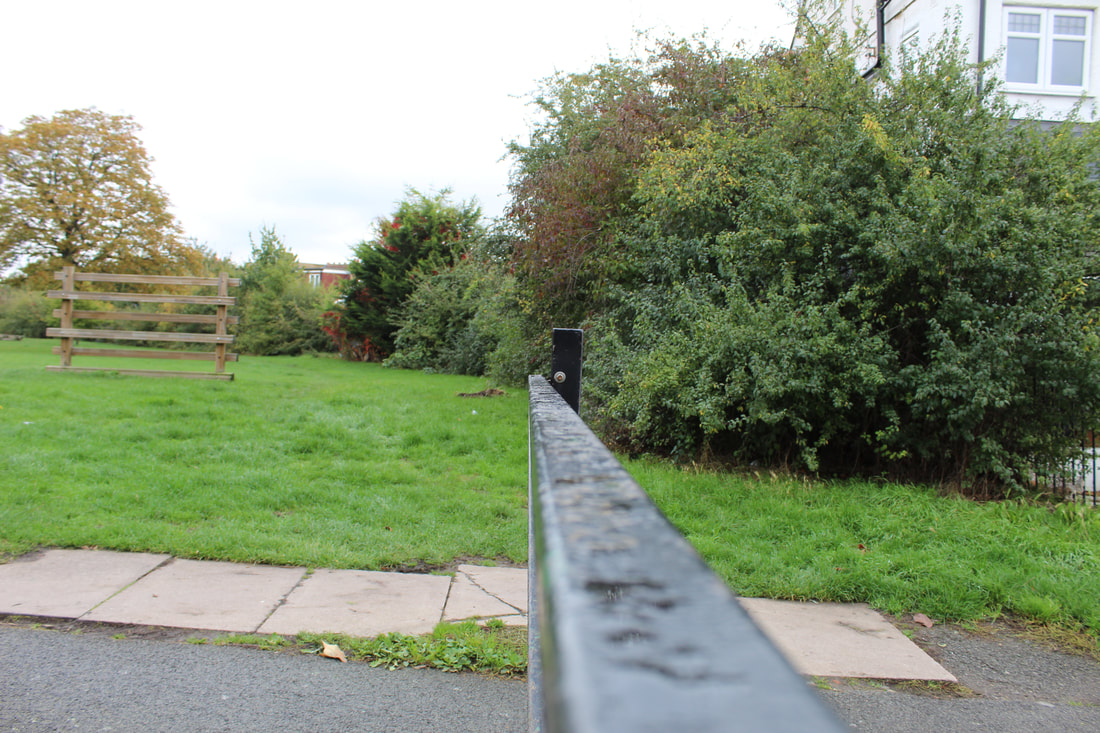
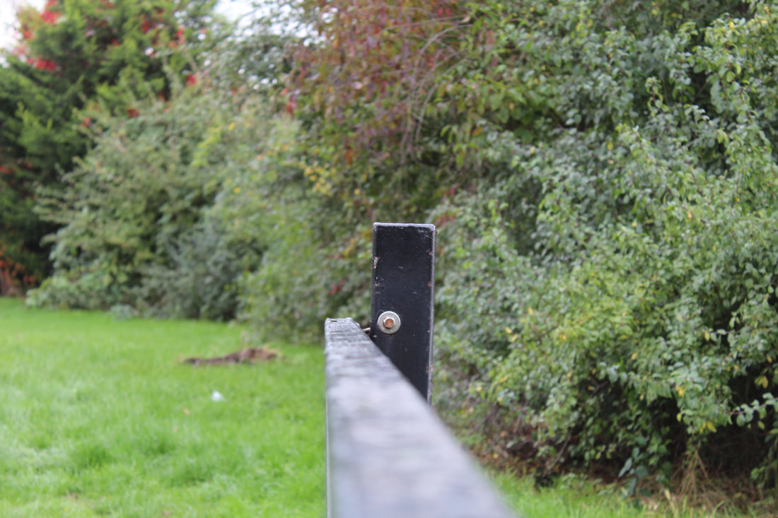
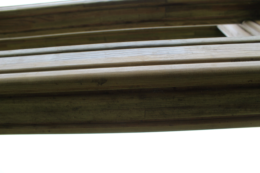
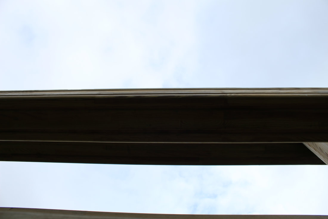
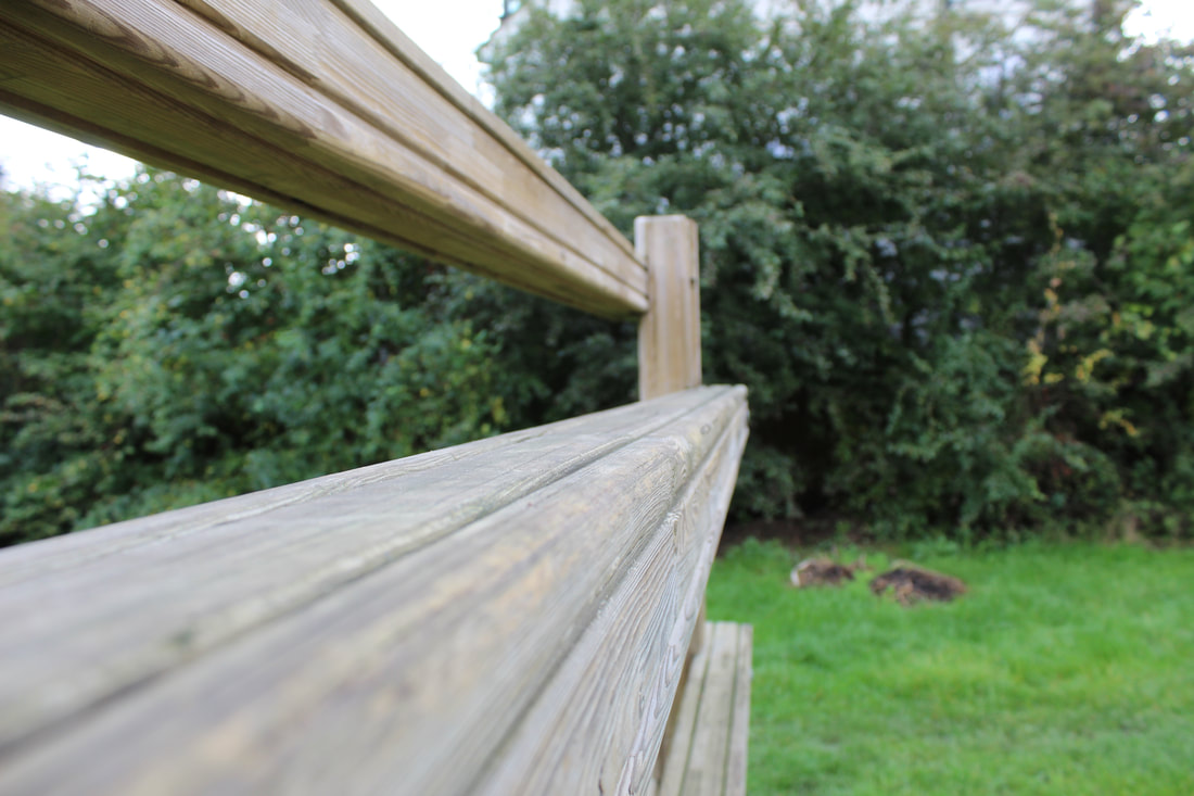
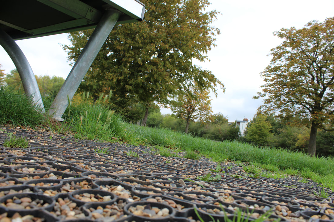
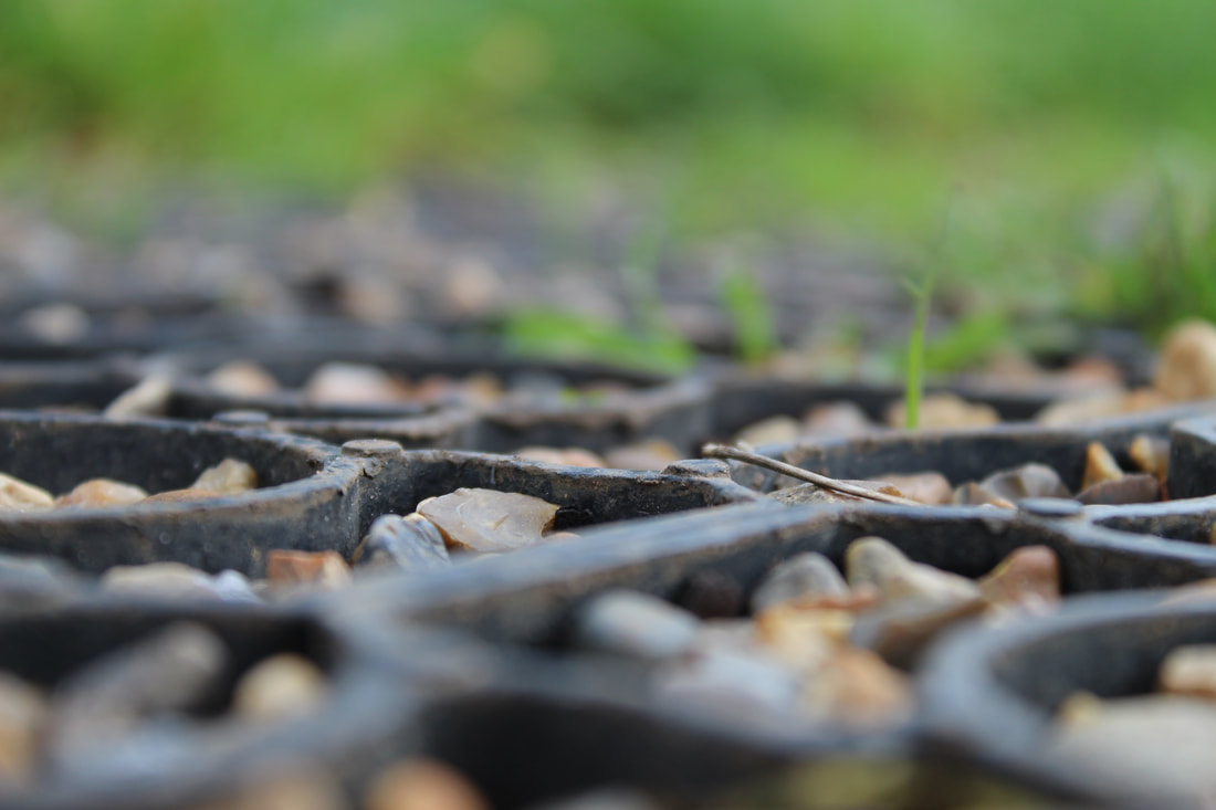
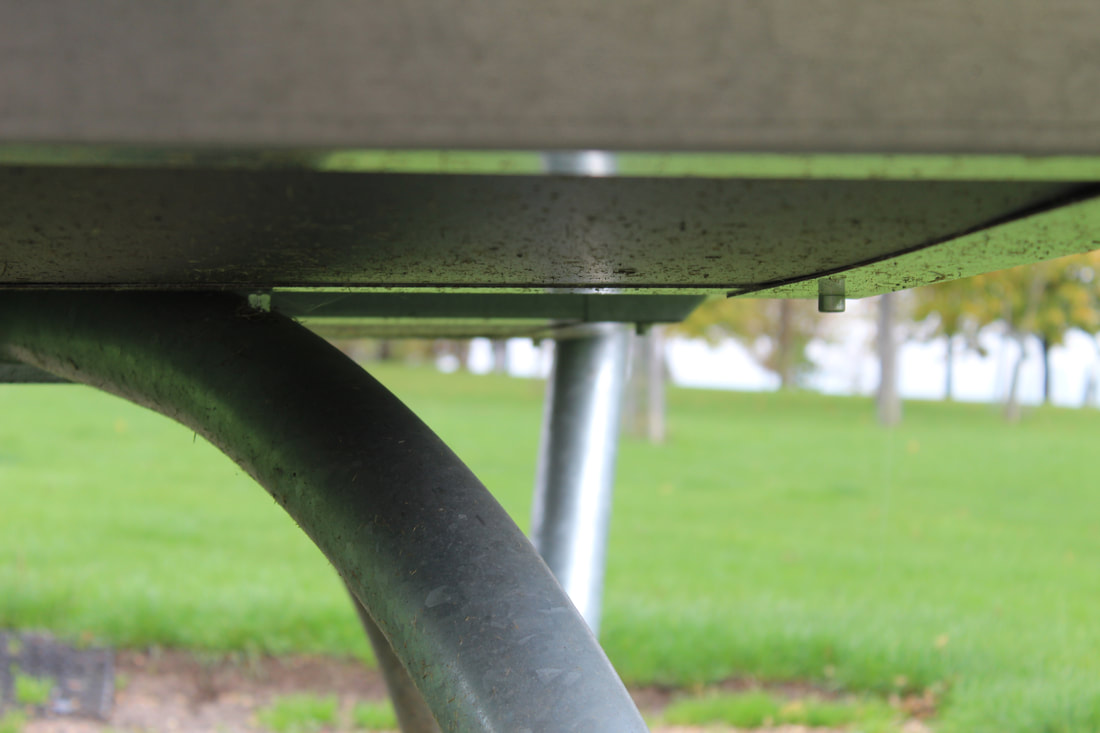
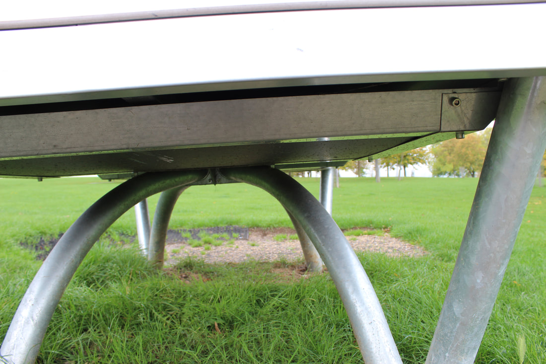
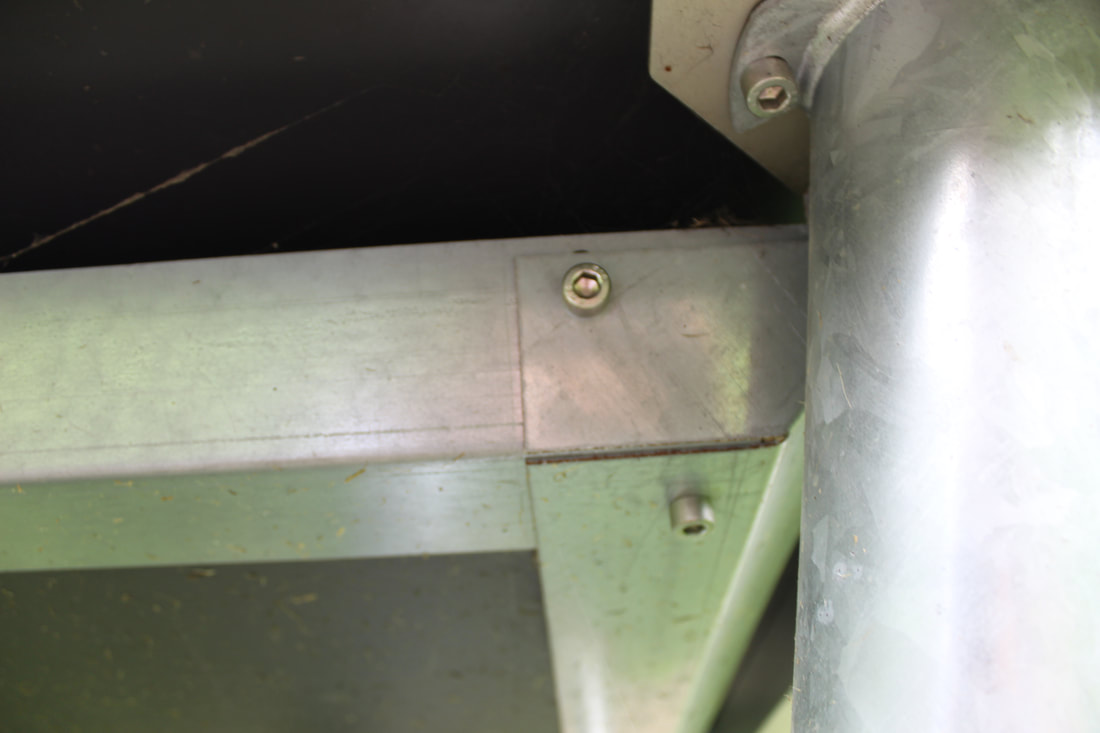
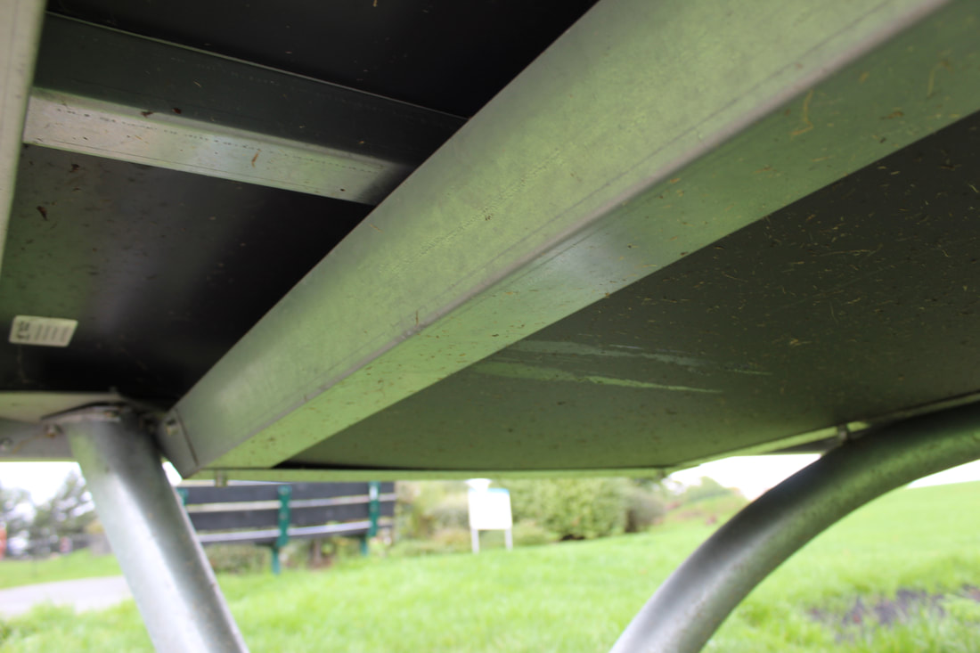
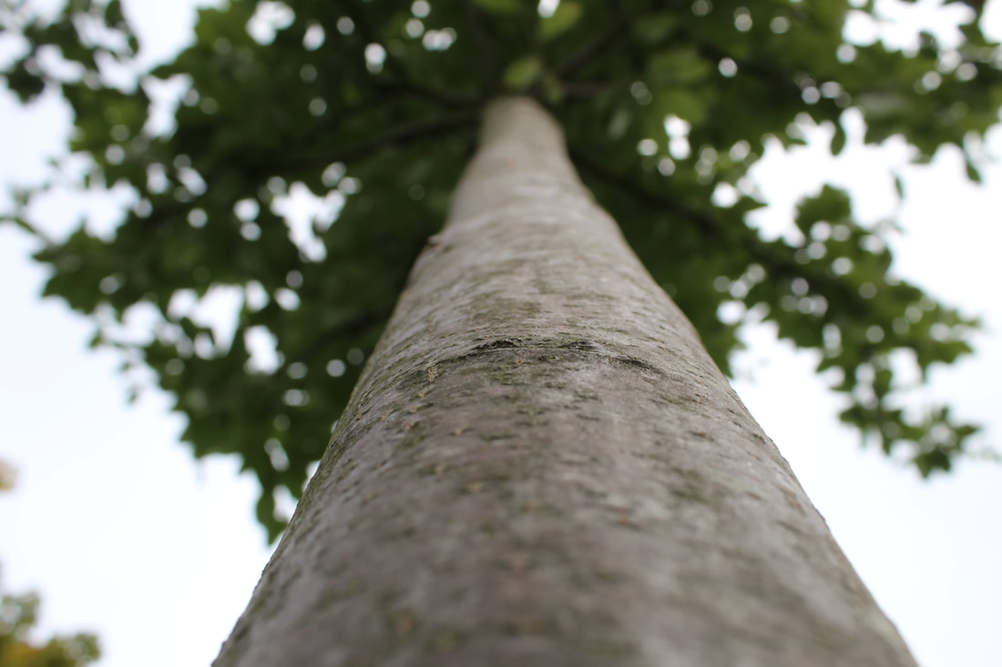
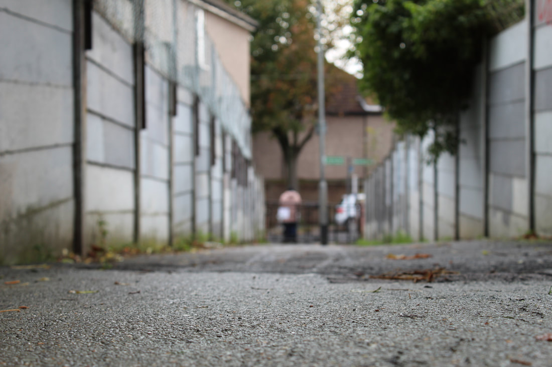
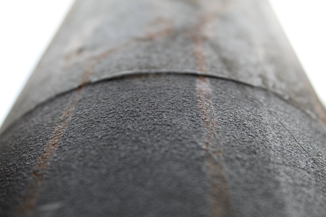
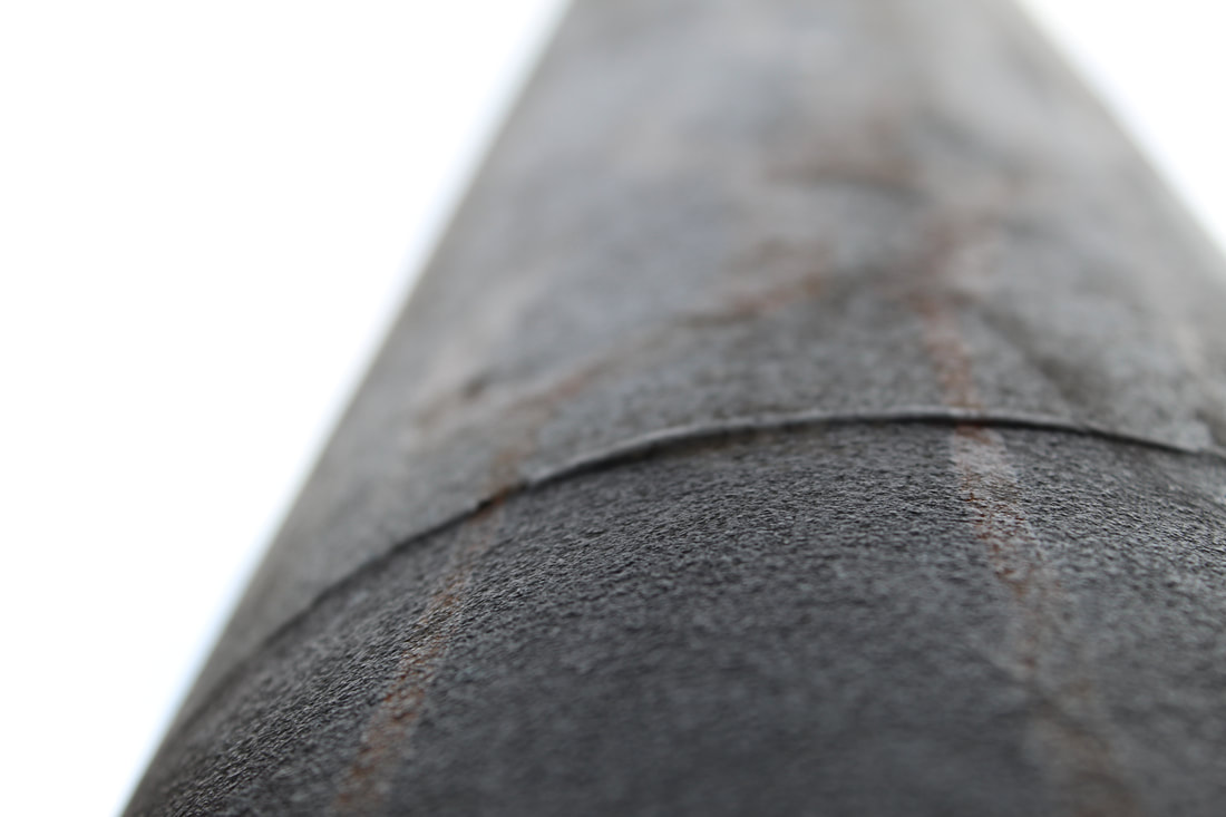
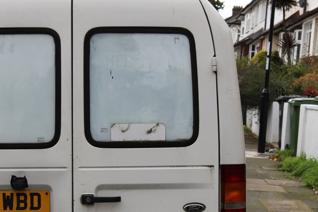
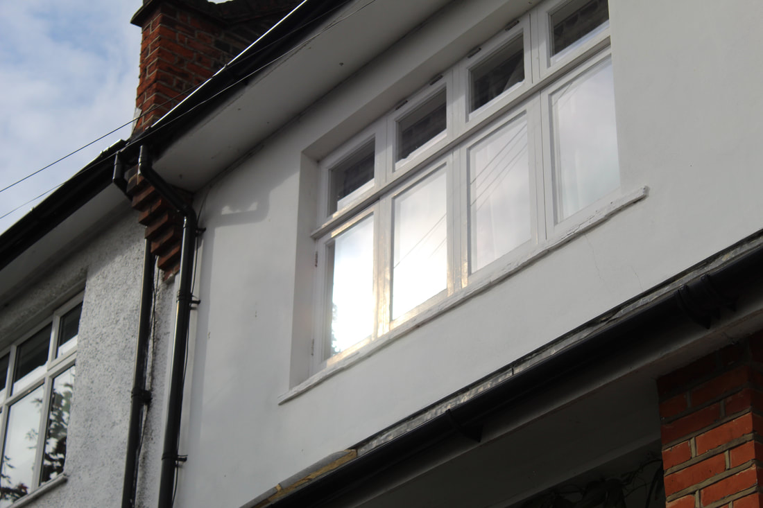
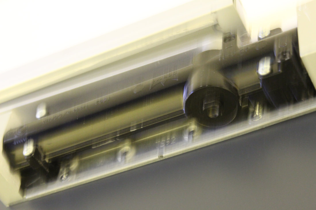
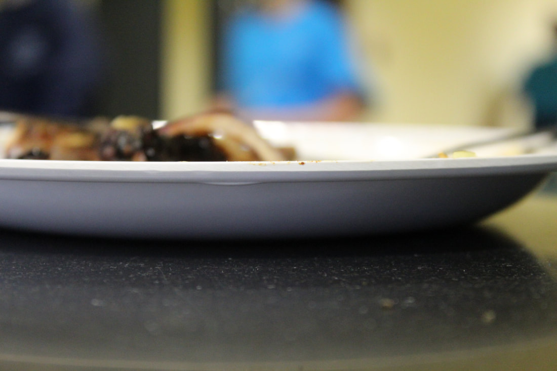
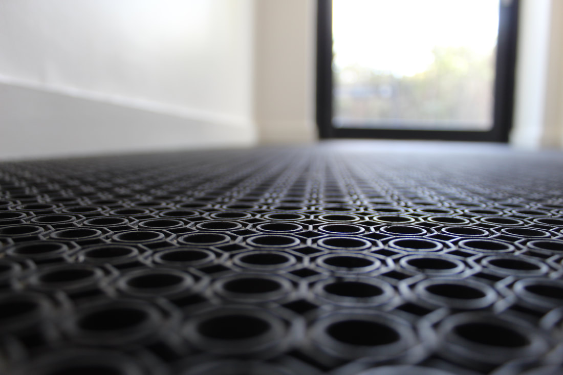
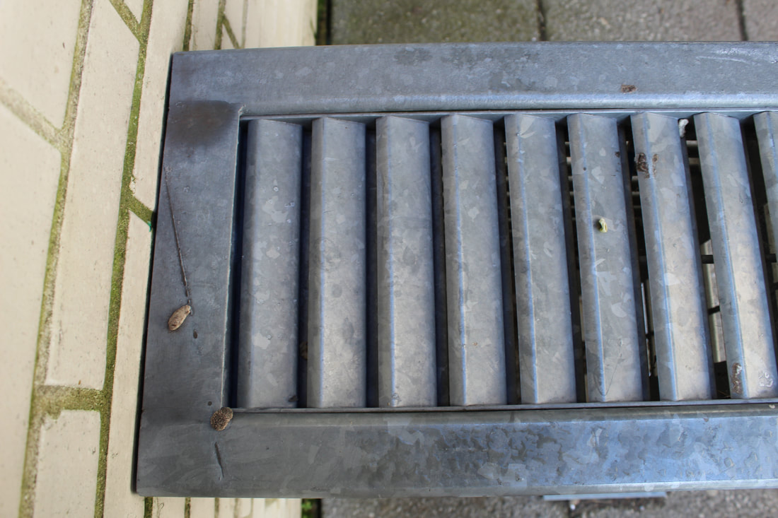
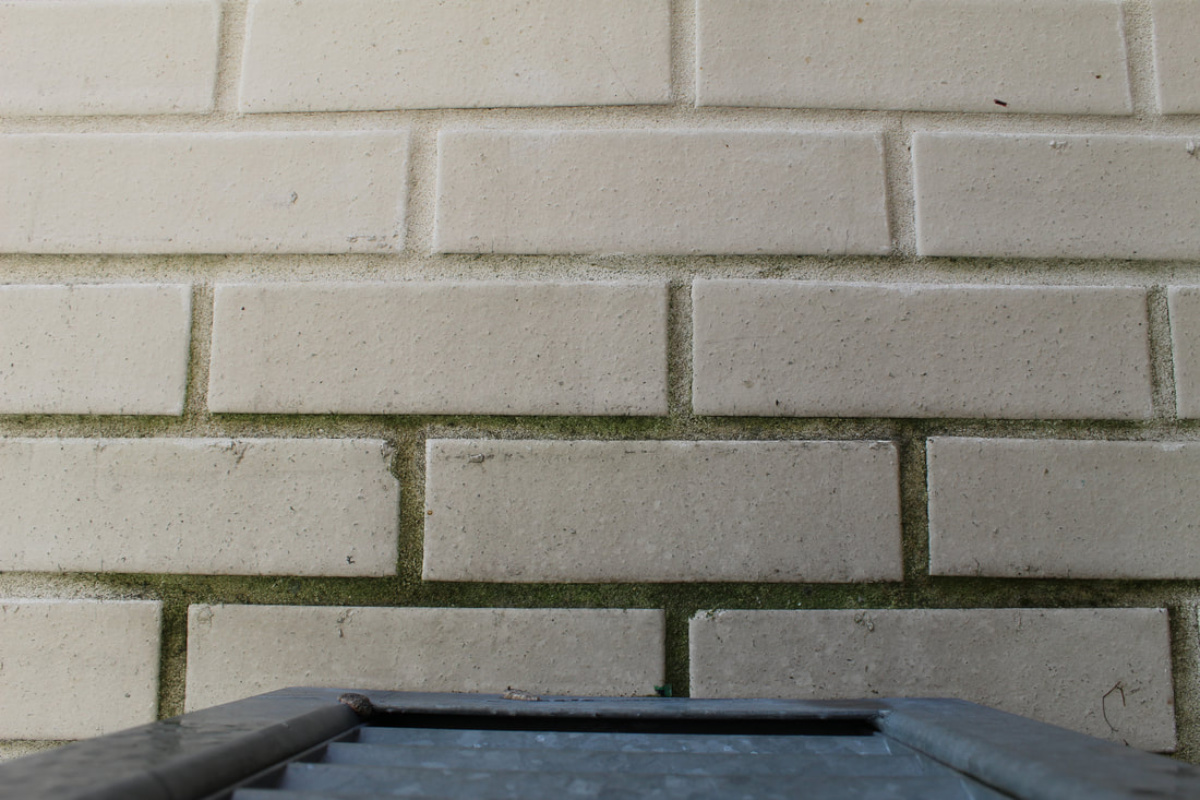
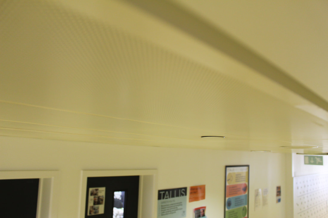
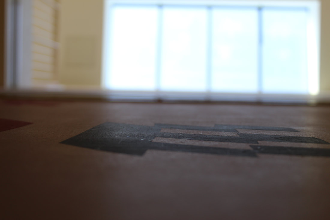
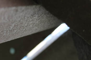
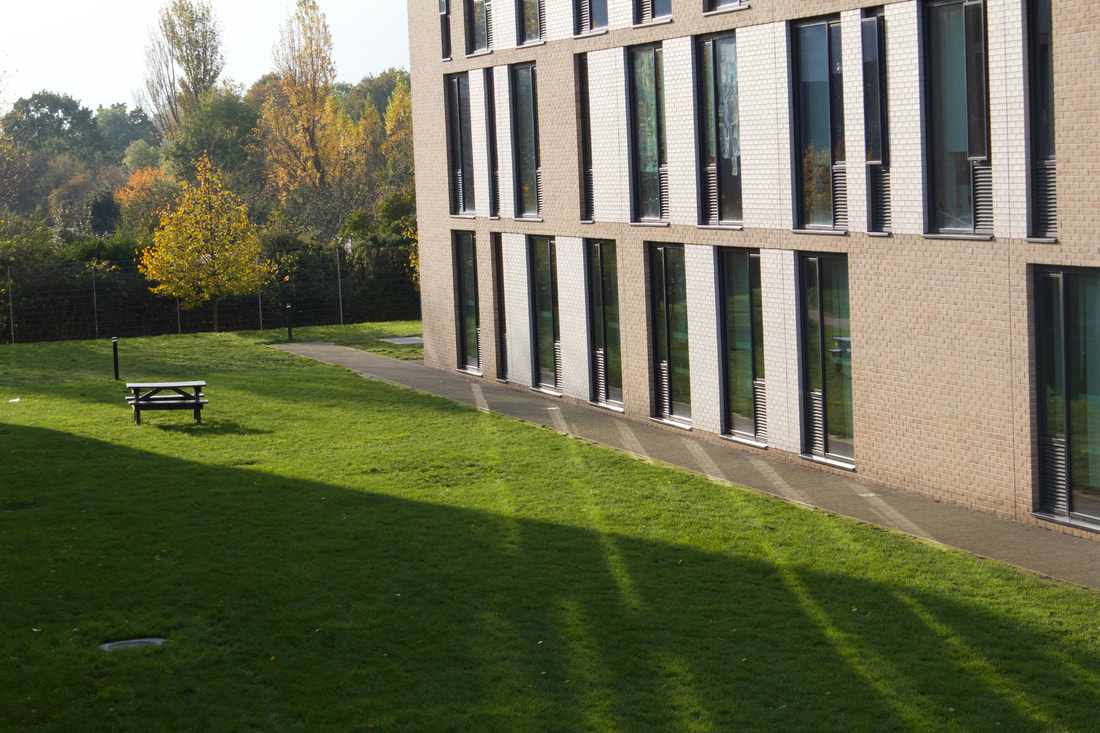
Inspired by Baldessari, I carried out a photoshoot following the instructions as stated above. I aimed to capture photos with extreme foreshortenings as well as focusing on the back or underneath of things; this proved difficult as particularly with cyclical objects, there appeared to be no back to it as it was constantly changing. This led me to taking photos using interesting angles as suggested, but predominantly at the back of the school so it hit two of the briefs.
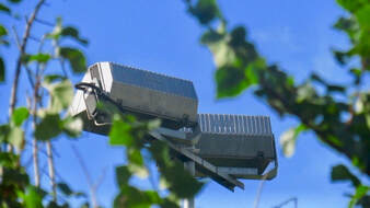
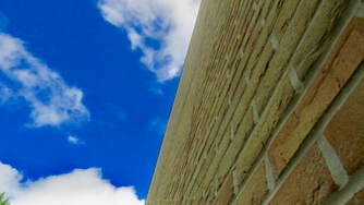
This photo works well because I have taken pictures of the back of the lights - which fits the brief - whilst having them partly submerged in trees. The photo was taken using the zoom on my camera, in reality I was too far from the lights to actually see any detail; this presents an uncharacteristic view as it is completely different from what I was seeing. I made the decision to not use extreme foreshortening for this photo because the structures look tall already in real life. Instead, I stood far away from the structure and zoomed in the give the lights less height .
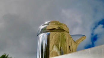
I think that this photo is successful as I have used foreshortening to make a water fountain appear somewhat indistinguishable, or like a teapot. As well as this, the structure appears bigger and grander than how it actually is which is another example of where foreshortening has enhance the object. The photo was taken of the back of the fountain from a low angle which follows the brief as it is from a different angle to the one it is typically seen from.
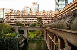
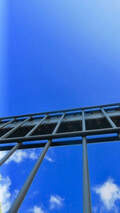
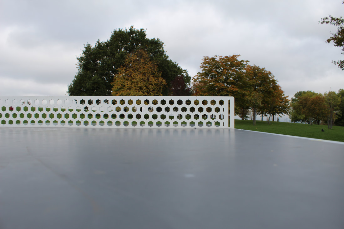
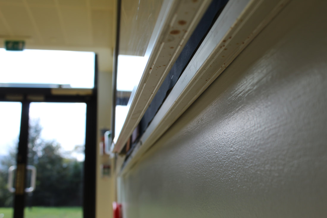
This photo works well as I used extreme foreshortening to present the wall as huge and endless and the angle it was taken at creates a stark contrast between the sky and the building. The angle also is different to how it is seen normally so I feel that it successfully fits the Baldessari brief. I later edited the photo to enhance the blue of the sky which consequently intensified the disparity between the two sides of the image.
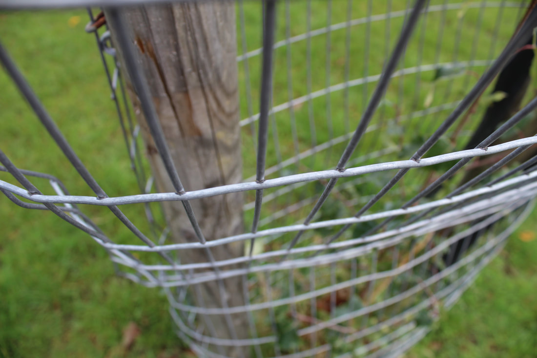
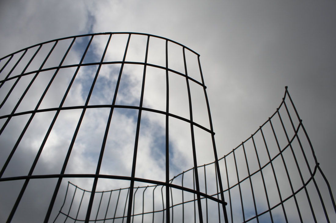
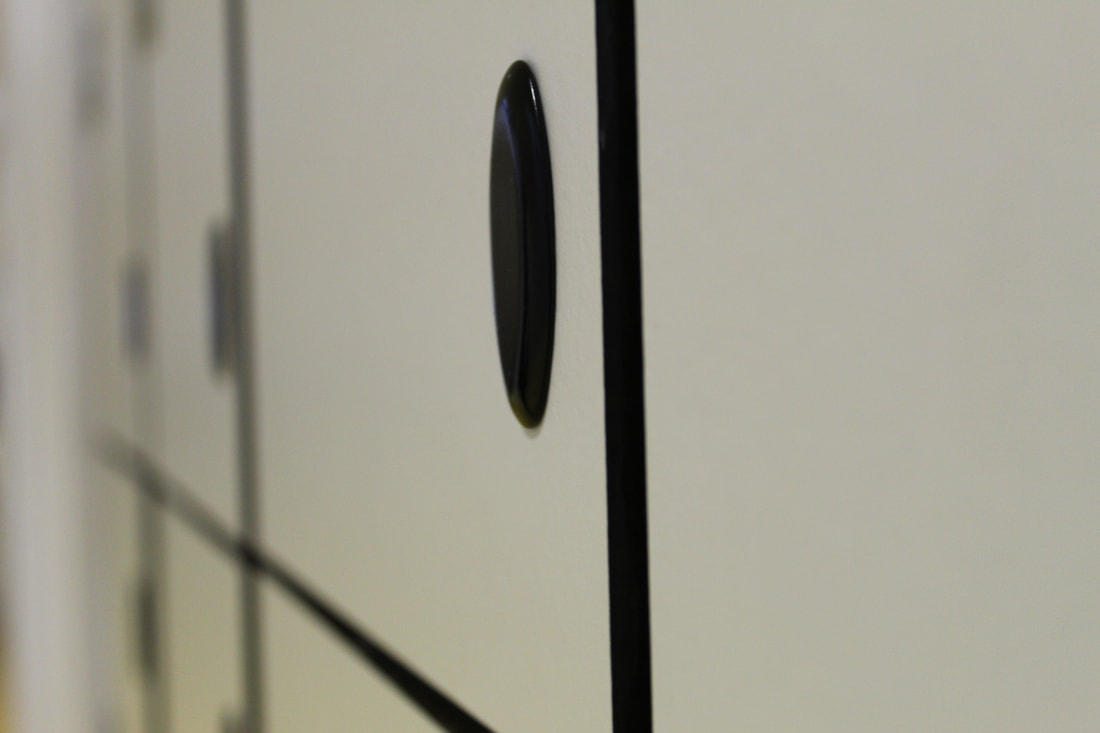
For this photo, I have made use of extreme foreshortening - much like the other photos - to emphasise the structures eminence. Although it follows Baldessari's brief of using these overexaggerated angles to heighten the fence I haven't followed the rule of looking at things in an unusual way as it is not untypical for a gate to be viewed in such a way that portrays it as large; to keep separated the two sides between which is stands. To further my response to the instruction, I should focus on changing the standard outlook for particular subjects. For example, if I were to look at a gate again, I would be sure to use foreshortening to present it as small or serving little purpose.
Another Attempt at Baldessari's List of Ideas
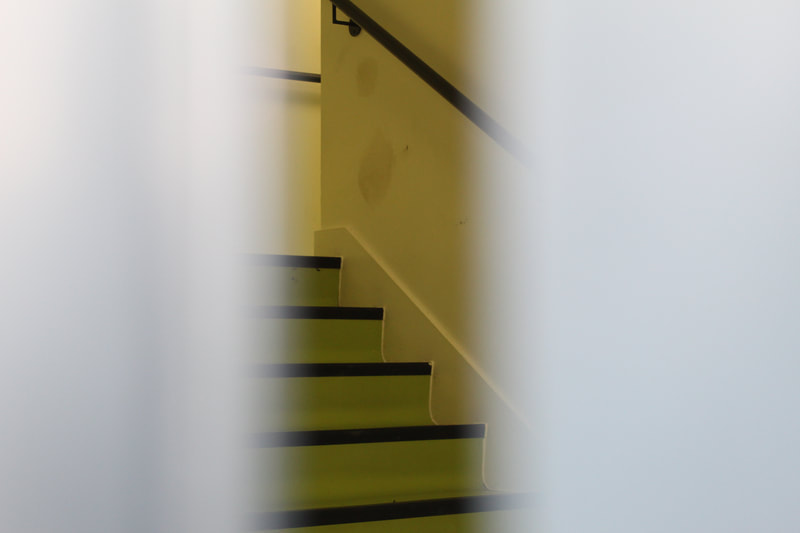


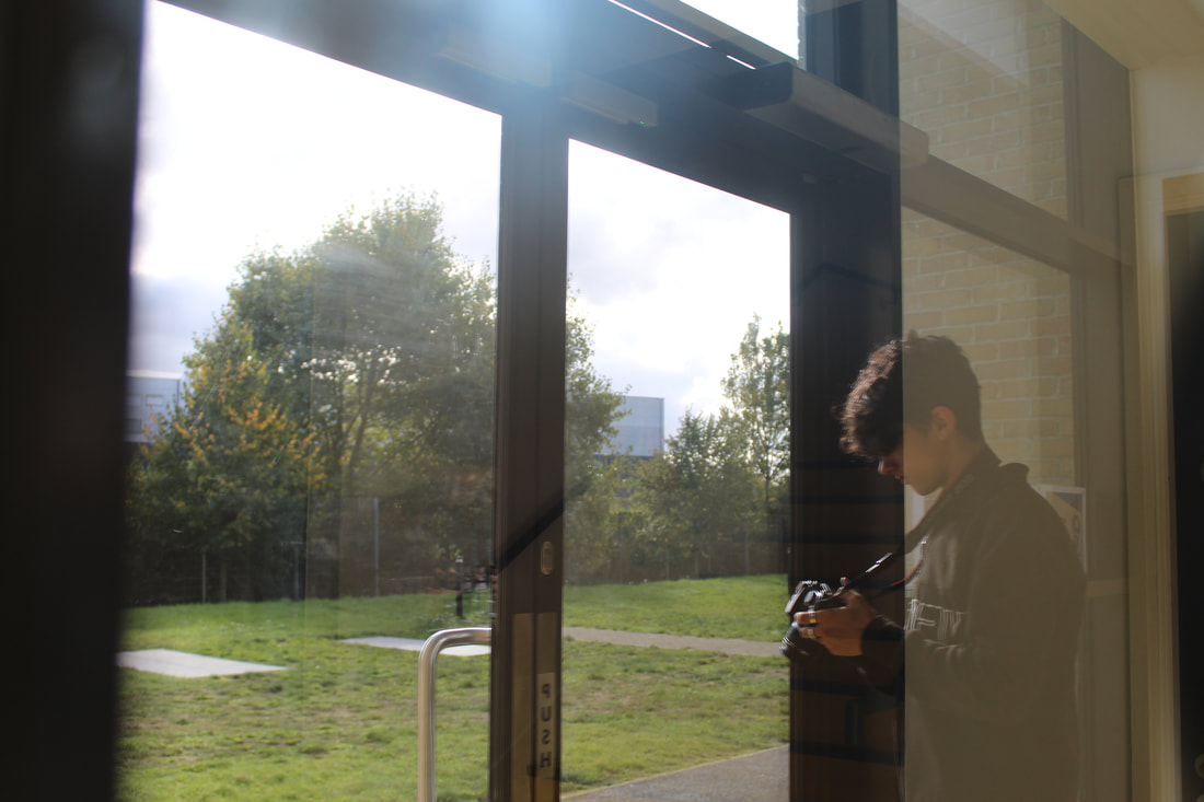

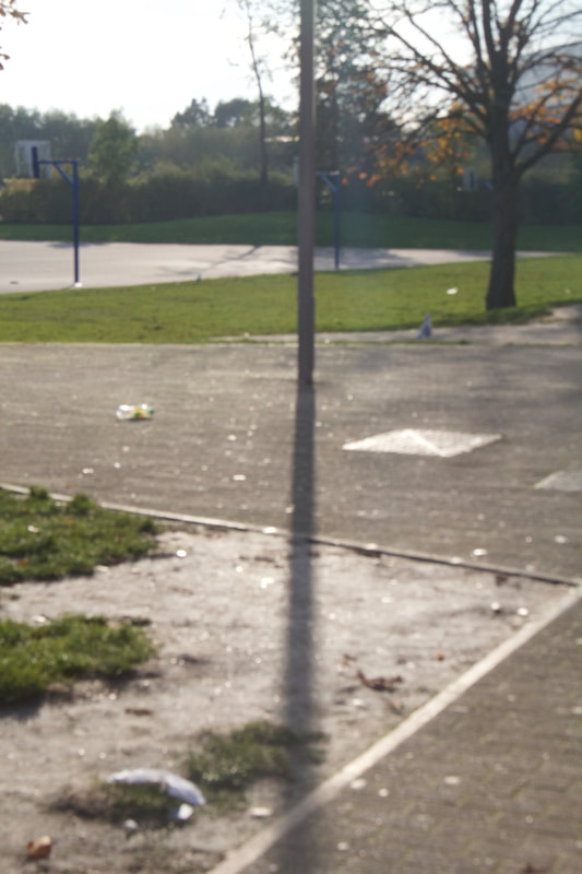
Following on from my initial response to Baldessari's list of instructions, I did another photoshoot, this time ensuring that I was more experimental and bended the typical rules of photography more than I had previously done. I made a greater use of extreme foreshortening so things became unfamiliarised and I played around with taking photos underneath or behind things. I also took photos with obvious obtrusions such as a reflective window and a crack in a door. I feel as though this outcome was more successful than the last
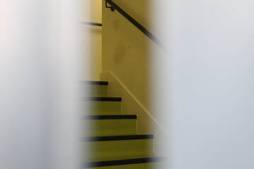


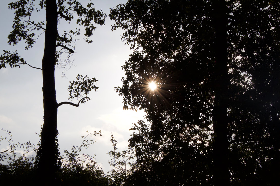
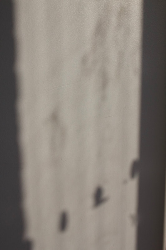
These photos are the most successful as they are idyllic and have had the most thought put into them. For the photo on the left I decided that shadows are nonthreatening and calming and create an easy depiction. In addition to this, the muted colours don't take much to process as well as the lack of movement seen. To emphasis this, I slightly unfocused the lens to achieve a blurred effect. The middle photo is also successful as it hints at the sunlight behind the trees without making a harsh or overexposed finish. Due to its lighting the trees appear to be silhouettes which creates a lack of texture and busyness in the photo. This is supported by the soft textures of the sky in the background and the softened sun.
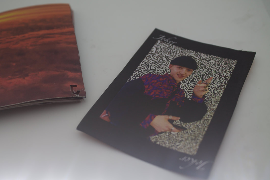
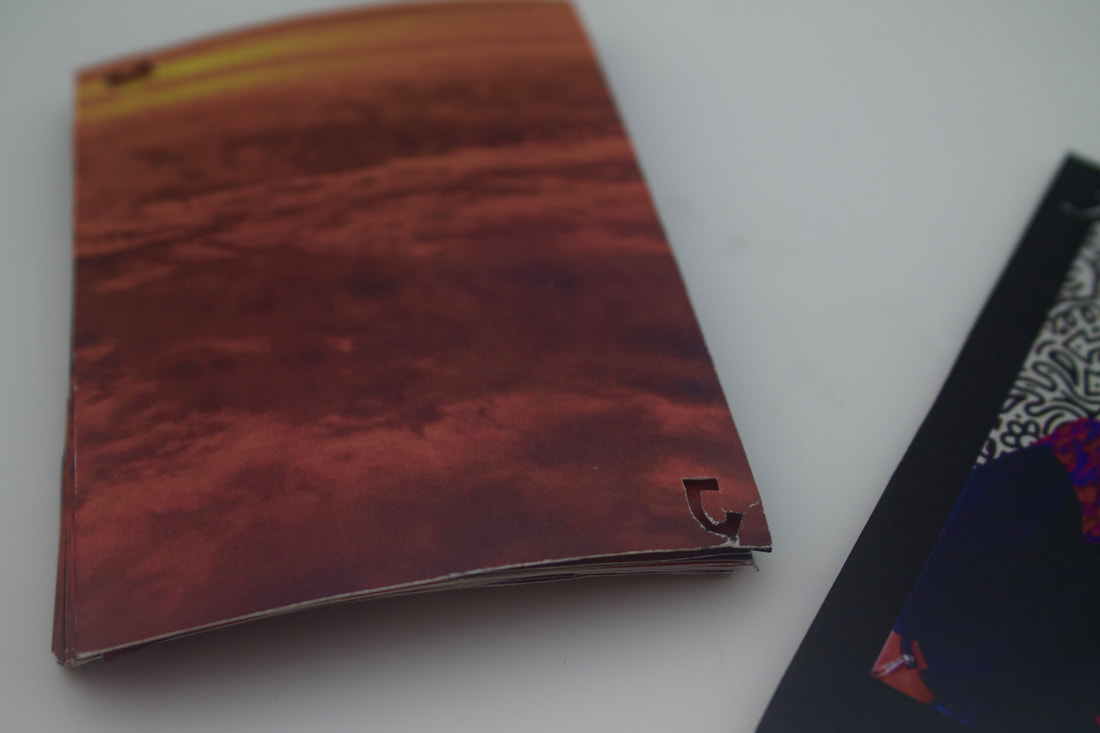
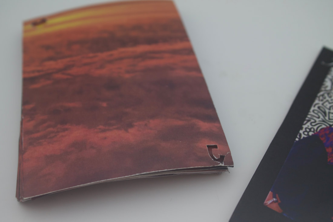
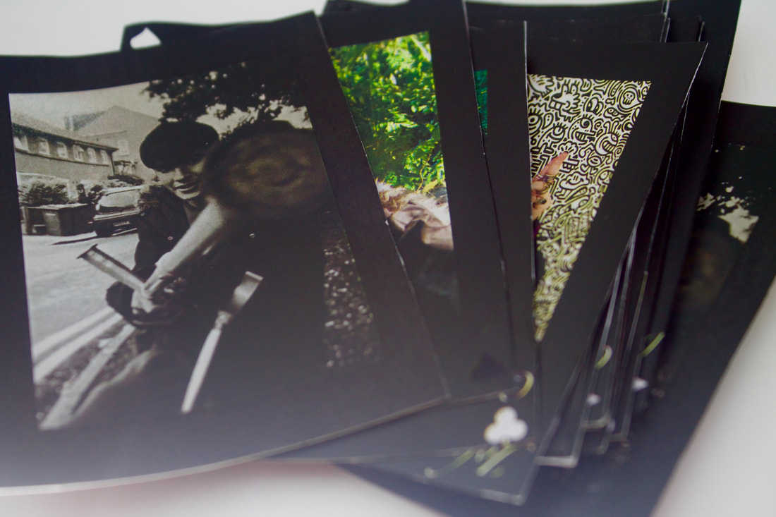
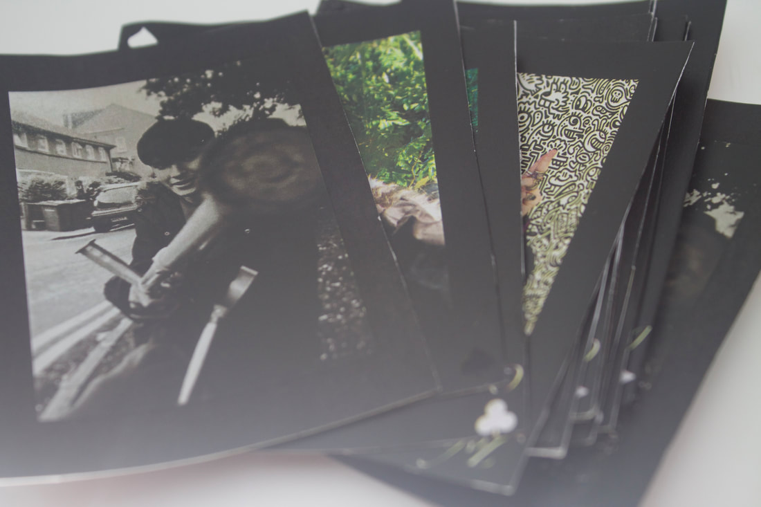
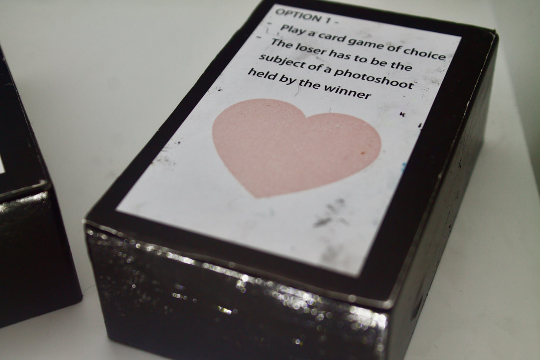
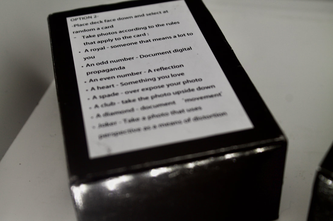
Making a photography game
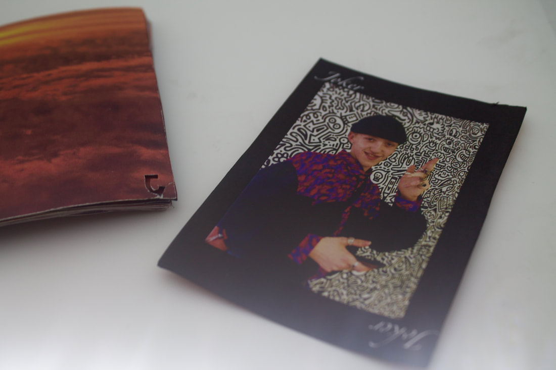
For this task I have chosen to make a deck of cards using portraits I have taken for the royals. This is inspired by John Baldessari whose work urges viewers to listen to his instructions and carry out their own art or photography. I also wanted to make the cards double sided with my own photos on the back as opposed to a pattern like on a typical deck. A problem that arose was that the first version of the cards had a poor printing quality and perhaps needed to be neater when glued together. Upon assessment I decided to change the photo of the back of the card to a picture of a sunset as opposed to the previous cloud photo as I felt the colours fit better with the red symbols on the front. I also chose to use a scalpel to cut out the letters and suits on the cards as the font was often too small to read when printed out and this made for a nice and clearer finish. For the box I painted a container black and stuck on the front and back two sets of instructions in the format of the other cards.
